Research | Users | Wireframes | Usability Test | High-Fidelity Prototype | Design System | Next Steps | Lessons Learned
Overview
PitchIn is a volunteering website that allows users to create their own “pop-up” volunteer opportunities. PitchIn strives to unite communities and create real change. PitchIn’s target audience is adult professionals who are looking for local opportunities to give back and get involved in the community that will fit into their own busy schedule.
the goal
Create a responsive website that allows volunteers to create their own events, quickly and easily improving the process of volunteering by allowing users to customize their events to their needs and making events more accessible, inclusive, and inviting.
Starting with Research
I looked at 5 volunteer organizations to get a feel for the services/products that already exist. My competitive analysis showed me:
Admired and Inspired By:
- Advanced filtering allows people to find volunteer events that target their main interests
- Well labeled sections make navigating the site easier
- Simple designs that keep the volunteering as the main focus
- Important information for volunteers is repeated in multiple places on site
Room for Improvement:
- As volunteer events generate from multiple organizations, some sites lack flow and consistency
- Descriptions of events can either be too wordy and overwhelming or lack important details
- Lack of community-oriented features; doesn’t bring people together
- No sign ups on website; redirects to different website and process begins over
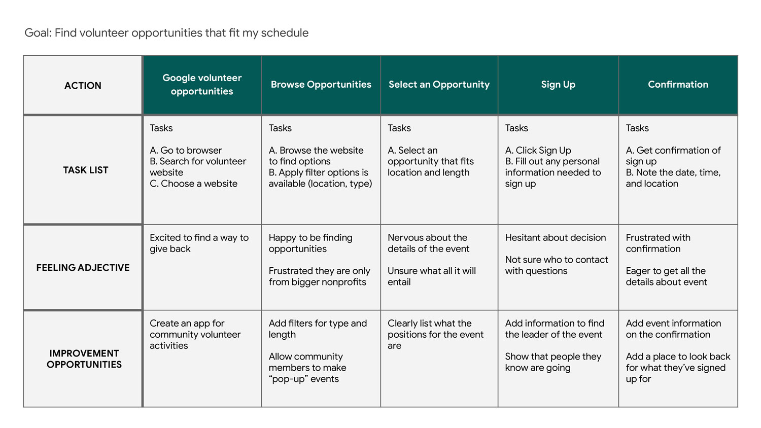
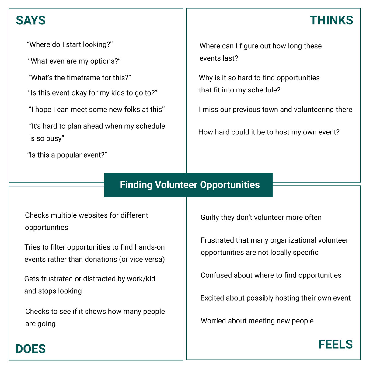
Let's Meet the Users
With some initial information gathered, I was ready to start getting to know my users and learn about their experiences.
research goals
- understand common challenges people face when looking for volunteer opportunities in their area
- pinpoint common frustrations people experience with volunteer experiences, either volunteering or hosting
- identify frustrations people experience when trying to meet new people in their community
I began by talking to people who volunteer at least 3-4 times a year. To gain a different
perspective, I also talked to some
people who don’t volunteer regularly but are interested in doing so.
I asked about their daily routines, experiences volunteering, and challenges they face when
finding volunteer events to participate in.
Here's what I learned:
Jamie, 41

Occupation: Sales Associate
Hometown: Toledo, Ohio
Family: Partner,one child
" Volunteering brings me closer to my community. I just wish it was easier to find opportunities that fit into my schedule "
Goals:
- Find one-time volunteer opportunities that you can sign up for last minute
- Be more involved in his community
- Find volunteer events he can do with his family
Frustrations:
- Many volunteer opportunities I see online are from big organizations, I want something more local
- I don’t know where to find the best opportunities for me
- I can’t commit to longer events
Jamie is a
He would like a tool to find volunteer opportunities that fit into his
schedule as he travels a lot for work and often last minute.
He is looking to find something that helps him make connections in his
area and offers a variety of opportunities that he could
share with his family.
" I want to get my students more excited to give back to their community! "
Goals:
- Be able to plan events for their students and community to attend
- Be able to communicate easily with their network of volunteers
- Get students more excited about volunteering
Frustrations:
- I’m not sure how to engage the students in volunteering and their community
- There’s a lack of sites to use to organize these events on a smaller level, most only showcase non-profit organization’s events
- Text and email chains can be difficult to make sure everyone is included
Andy is a new professional who is trying to make an impact
on their school and community. As part of their job, Andy is in charge
of the volunteer
efforts the school encourages students to participate in.
Andy wants to be able to easily find and create volunteer opportunities for
their students and parents to get involved with. They want to
easily
communicate with those participating in their event and would like to
find a way to get students more engaged in the process.
Andy, 27

Occupation: Guidance Counselor
Hometown: Aurora, Colorado
Family: Single
Click image to enlarge
Click image to enlarge
Click image to enlarge
Click image to enlarge
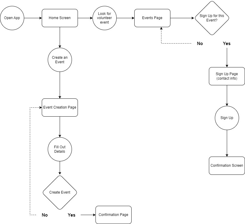
Wireframing
From my research I determined the design should include solutions that save the user time and
allow them to better engage in their community.
Users want to find opportunities quickly and be able to easily filter and sort based on their
preferences and needs. The design should include an intuitive
process to sign up and create events as well as a platform for communication.
View wireframes in-depth.
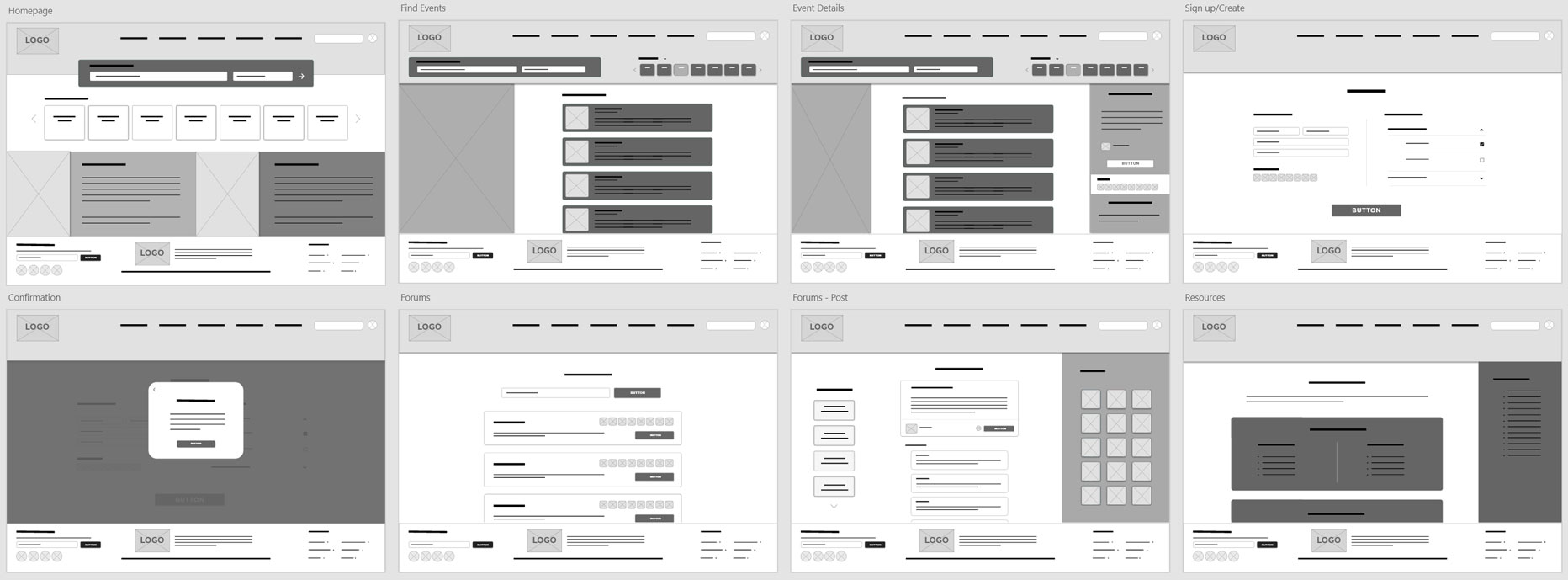
Click image to enlarge
Usability Testing
Using my low-fidelity prototype, my usability study consisted of 5 participants who volunteer at least once every 2-3 months or lead volunteer events. I asked them each to complete the following:
- Prompt 1: From the home screen, please find the “Trail Clean Up” event
- Prompt 2: Now, sign up to bring sandwiches to the “Trail Clean Up” event and continue through the process until you reach the confirmation page
- Prompt 3: Create a new volunteer event. You will need two donations items and on-site volunteers to make the event a success. Continue until you reach the confirmation page for your event
- Prompt 4: Navigate to the forums page, find the Lake Clean Up community and view their most recent post
- Prompt 5: Please locate the section of the website where you would be able to find resources if you were in need of housing assistance
- Prompt 6: How did you feel about the site overall? What did you like or dislike
Results
After organizing and grouping the feedback into an affinity diagram, it was clear that four of the main processes needed some improvement:
sign up process
event creation process
resources page
forums page
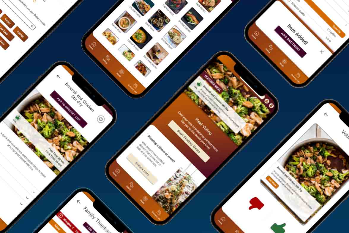
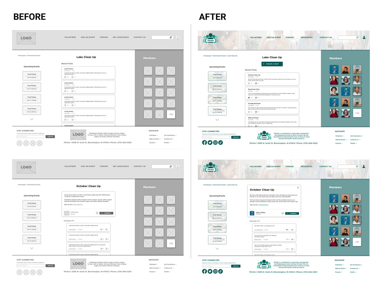
High-Fidelity Prototype
Based on patterns identified through the affinity diagram, some key elements were updated or incorporated into the design:
5 out of 5 participants were confused by the wording or interactions with completing their sign up in terms of choosing donations or volunteer hours
Users need the sign up process to be more intuitive and include clearer language
Improvements:
- Separated the sign up process into multiple pages to reduce cognitive load on a single page
- Reworked the wording and process for signing up for specific roles. Wording was workshopped with multiple users to make it more clear and accordion menus reduced information on the page at a single time
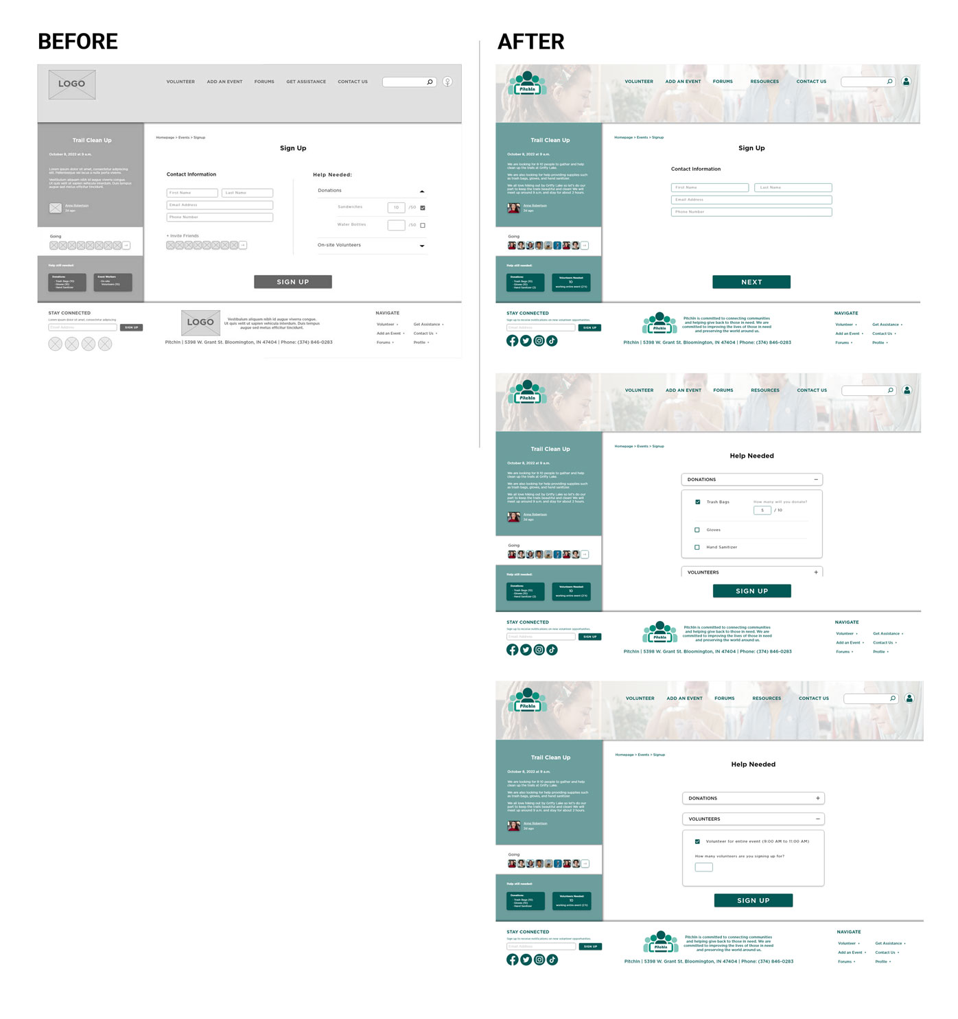
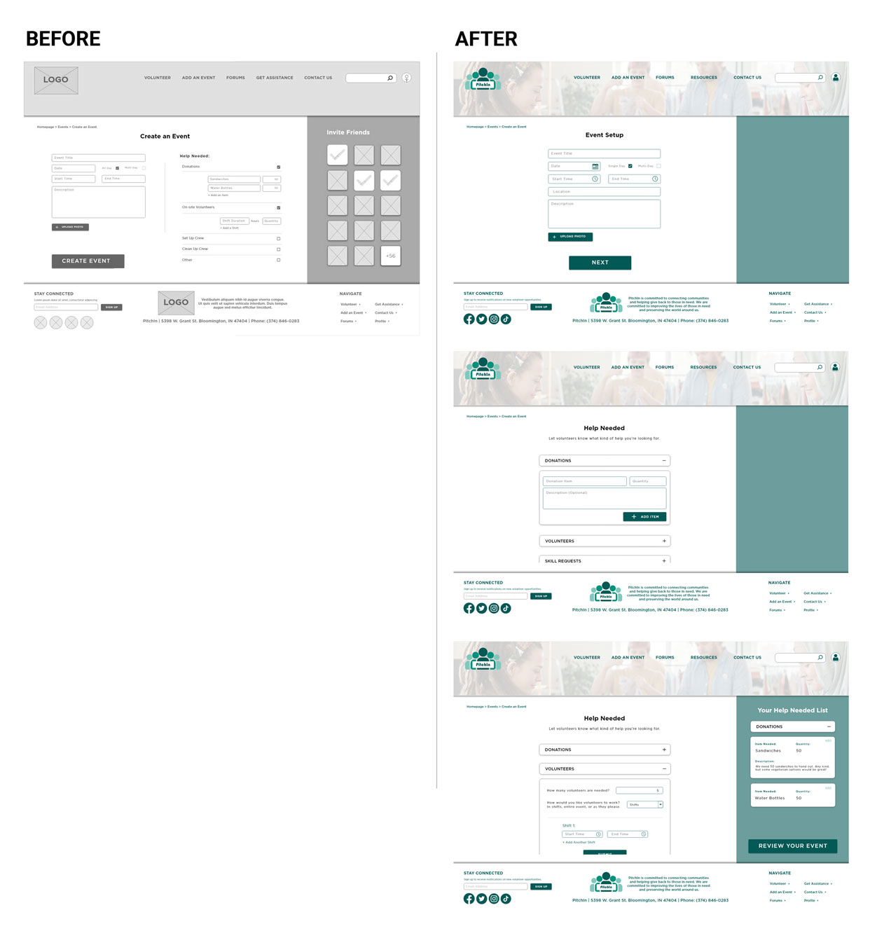
5 out of 5 participants were confused by the wording for creating an event specifically adding in their needs for donations and volunteers
Users need the event creation process to be more intuitive and include clearer language
Improvements:
- Separated the creation process into multiple pages to reduce cognitive load on a single page
- Reworked the wording and process for signing up for specific roles. Wording was workshopped with multiple users to make it more clear and accordion menus reduced information on the page at a single time
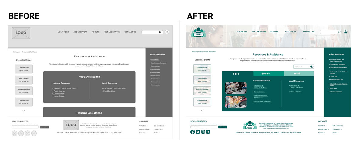
4 out of 5 participants were overwhelmed or unhappy with the layout of the resources page and felt it could be better laid out
For most users, the resources page needs more organization to help users find resources more quickly and easily
2 out of 5 participants were confused by the wording of the “Get Assistance” page
Some users need clearer communication about what information the page contains
Improvements:
- Reorganized resource information into categorical tabs to help users more quickly find what they need and reduce scrolling
- "Get Assistance" was updated to "Resources" for clearer communication
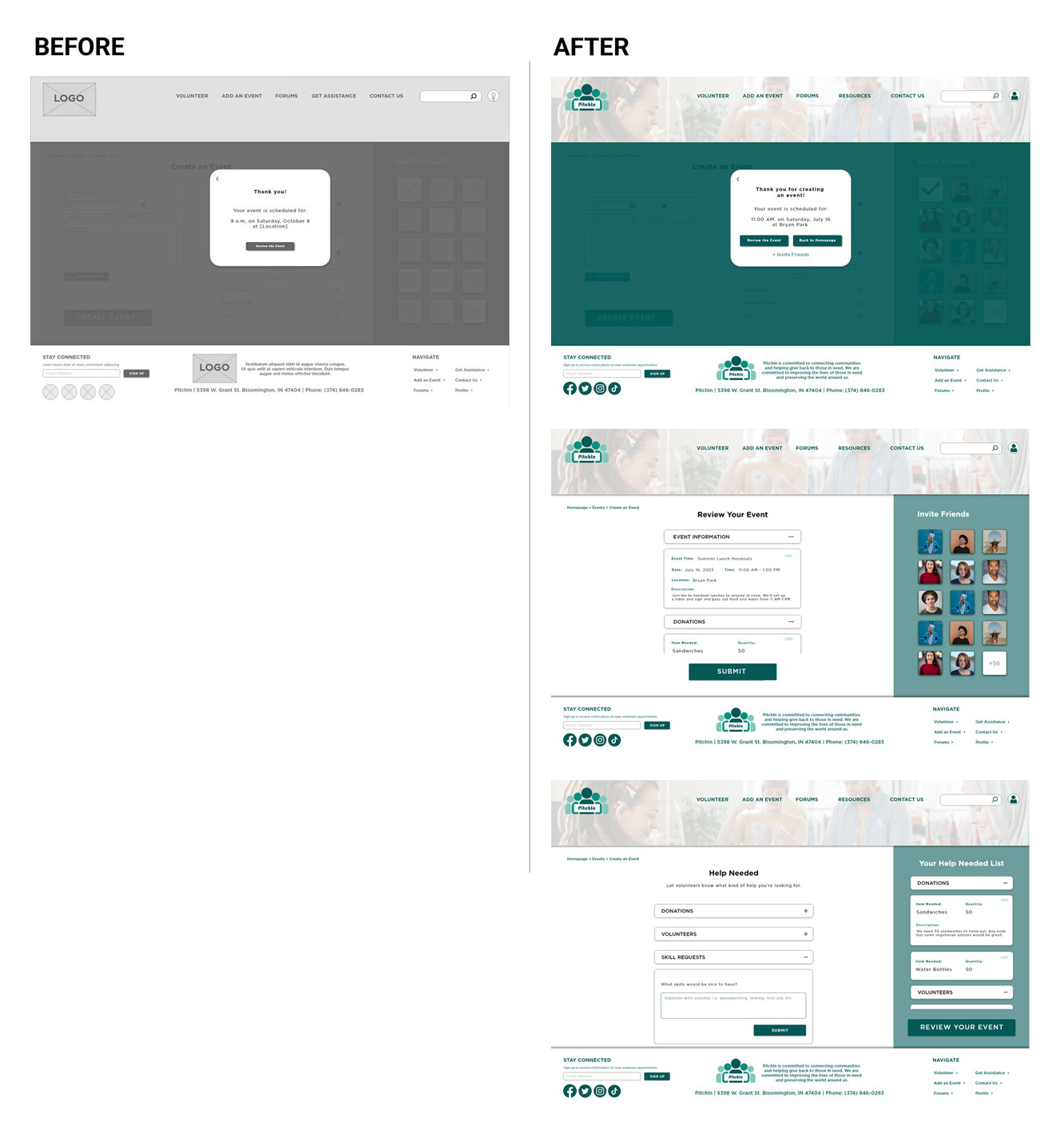
3 out of 5 participants were frustrated with the event review and lack of editing for the process of creating an event
For most users, the event review needs to happen before submitting the event and should be editable after the creation process is complete
Improvements:
- A column was added to the right side of the page that shows what users are adding as they go along the creation process and allows editing
- A review page was added before completing the creation process to act as a final look before submitting
- "Review Your Event" button was added to the event creation confirmation page
3 out of 5 participants were frustrated with the forums navigation either from not being able to view other posts or not being able to create a post
Users need the forums page to have updated and more intuitive navigation as well as updated functionality for basics like posting
Improvements:
- "Create a Post" button was added to the forums page
- An exit button was added to individual posts so that users can easily and quickly view multiple posts
- Updated breadcrumb navigation to allow users to more quickly get around the forums
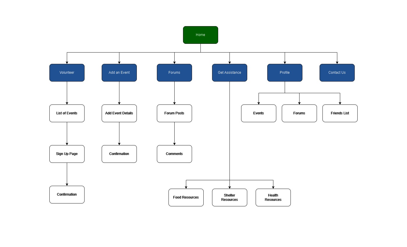
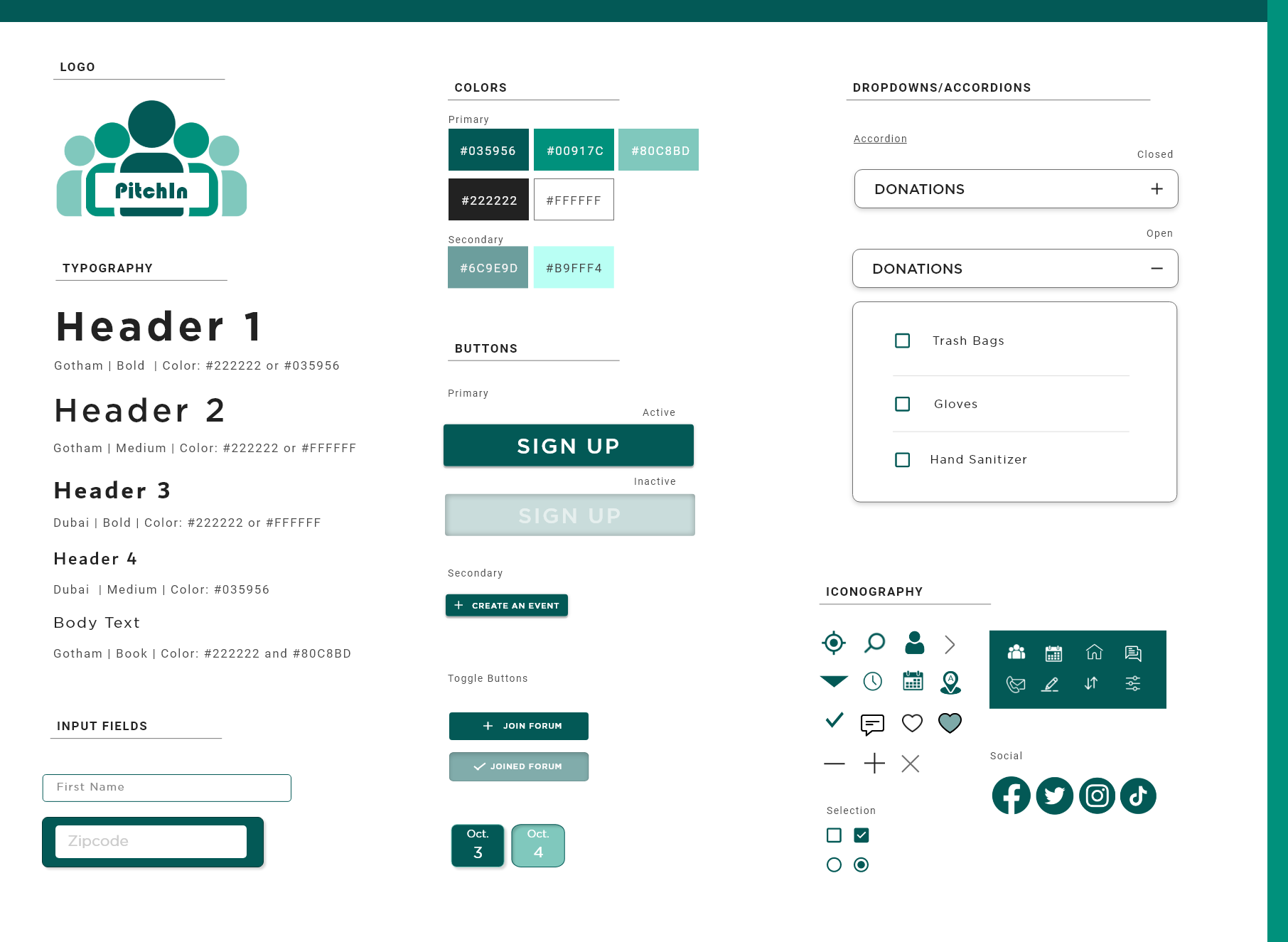
Design System
Next Steps & Recommendations
Accessibility:
- Implement additional accessible design elements such as keyboard and screen reader accessibility
- Conduct user testing with individuals who have disabilities to gather feedback and ensure accessibility needs are met
Hand-off:
- Create a detailed outline explaining design decisions and interactions
- Ensure all design files and assets are organized and labeled correctly
Additional Testing:
- Conduct further usability testing to gather feedback on the updated user flow and design
- Conduct research on how organizations would feel posting opportunities on this platform
After Launch:
Track the following KPIs after launch:
- Number of downloads: How many people are interested?
- Task Success Rate: How many users are actually signing up for events or creating events?
- System Usability Scale: How usable is this platform compared to other volunteer platforms?
- Customer Satisfaction: How are the users responding to the website?
Lessons Learned
Design Without Functionality Will Fail
I was very excited to include a forums page in this design. Not only did it satisfy my user’s
desire to connect, it was the first design in which I included some type of communication page
for user to user.
In my excitement, I forgot to include a way for user’s to actually create new posts.
Functionality should always be at the forefront of your design. No matter how beautiful your
product is, it needs to be usable first and foremost.
Try and Try Again
I will be the first to admit, I struggled with creating the process of setting up and signing up
for volunteer events. It felt choppy and unappealing when I was designing it but I decided to
keep it and get some feedback before redesigning.
This resulted in being able to design the process based on initial feedback which ultimately
helped me brainstorm a process I, and my users, loved!
Tidy Up Your Pages
Doom scrolling has become a very popular topic these days. Not only can long pages create bad
responses, it can cause users difficulty in finding what they’re looking for and higher drop-off
rates.
Make sure your pages (mine was a long list of links to resources) are clearly organized.
Dropdowns, accordions, and tabs are your friend when organizing!