Research | Users | Wireframes | Usability Test | High-Fidelity Prototype | Design System | Next Steps | Lessons Learned
Overview
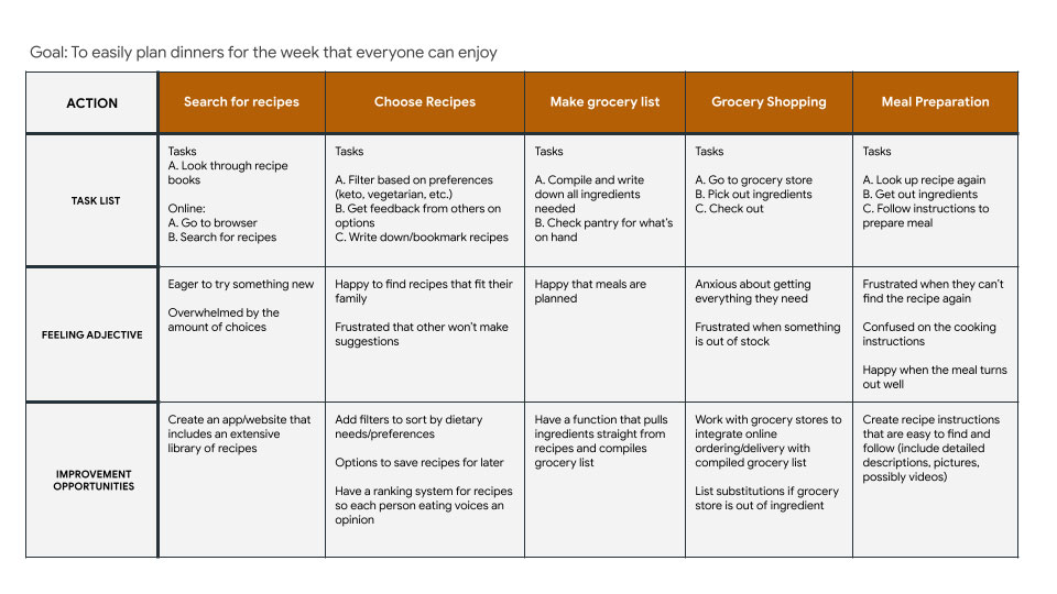
Meal planning can often be a source of stress and conflict in many households. It is time-consuming to sort through recipes and leaves uncertainty as to whether or not the meal will satisfy each person’s tastes and preferences. How can we relieve this stress and save time on meal planning?
the goal
Create an app that streamlines the process of planning weekly meals and compiling a grocery list. This app should reduce the timeframe and stress it takes to create a weekly meal plan by allowing users to rate meals and create a meal plan based on meals that were approved by all participating parties.
Starting with Research
Before even thinking about design, I wanted to get a feeling for what products were already out there. I analyzed 5 apps and websites that assist with meal planning and found this:
Admired and Inspired By:
- Options to quickly create a grocery list based on saved meals
- Community based interactions to incorporate a social aspect
- Popular recipe sections allow users to more quickly find recommendations
- Personalized searching and recommendations based on allergies, dietary preferences, and dislikes
Room for Improvement:
- Many apps have nutritional information hidden behind a paywall
- Lack of or inconsistent descriptions on cooking steps
- 1,000,000+ recipes is a great variety to choose from but can often result in doomscrolling even with filtering
- Text-heavy pages can be overwhelming to the eyes, especially with cooking steps
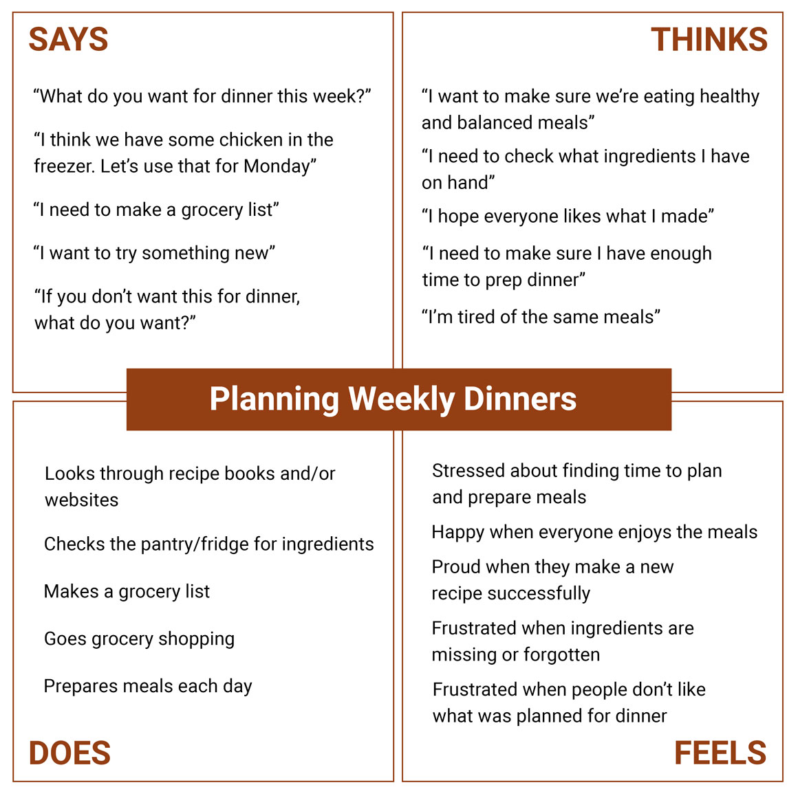
Let's Meet the Users
With some initial information gathered, I was ready to start getting to know my users and learn about their experiences.
research goals
- understand common challenges people face trying to manage a busy schedule and plan/execute dinners for their families
- pinpoint common frustrations people experience when planning meals for everyday dinners or events
I began by talking to people who make meals for their family at least 4 times a week.
I asked about their schedules, eating habits, typical dinners, and challenges they face
when planning meals.
Sarah, 38

Occupation: Certified Public Accountant, CPA
Hometown: Santa Cruz, California
Family: Partner, two children
" I just want simple, quick meals that my whole family can agree on "
Goals:
- Plan a variety of meals for the week for her family
- Save time on meal planning and grocery shopping
- Save money on groceries and avoid eating out for convenience
Frustrations:
- Doesn't have a lot of time to dedicate toward meal planning and preparation
- Difficulties finding recipes that everyone in the family will enjoy
- Navigating the preferences and dietary needs of her children (picky eaters)
Sarah is a hard-working CPA who values family time, especially sit down
dinners each night to catch up from the day.
With her busy schedule, she finds it challenging to decide what to
cook, resulting in repetitive or unhealthy, quicker options.
Now that her children are getting older, she is looking to involve her kids
more in the meal planning process to save time and
stress. Sarah is looking for a user-friendly app, that children could also
use, to simplify the meal selection process and quickly
find recipes that suit her family’s needs.
" I love cooking with my partner, but it can get boring cooking the same things over and over "
Goals:
- Explore new meals and add variety to their diets
- Save time and reduce stress associated with meal planning and prepping
- Discover recipes they both enjoy and could potentially use for dinner parties
Frustrations:
- Balancing busy schedules and personal commitments with daily household activities
- Finding motivation and inspiration to plan and cook meals regularly with their partner
- Avoiding food waste when cooking for two people and trying new recipes
Lee is an adventurous, creative person who enjoys trying new things,
especially with their partner who shares
an equal passon for new experiences. One of the things they love doing together is
cooking, but are tired of
making the same recipes. They often have little arguments over what to
eat or what to try.
Lee is looking for a way to more easily find and share potential
recipes with their partner. Lee is looking
for a source with a variety of recipes that meet the couple’s
dietary preferences. With his busy social schedule,
Lee needs a streamlined process in which they can quickly sort through
recipes and make a grocery list.
Lee, 29

Occupation: Operations Manager
Hometown: Chicago, Illinois
Family: Partner
Click image to enlarge
Click image to enlarge
Click image to enlarge
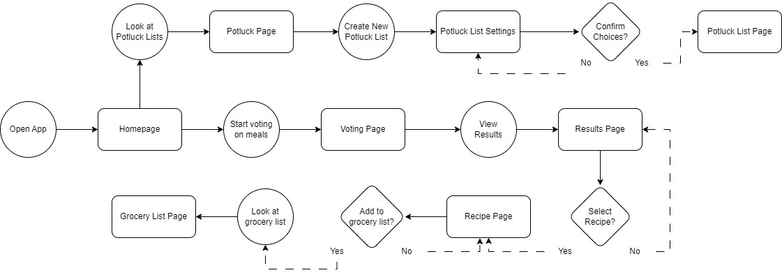
Wireframing
Based on the research and empathy exercises, I created my wireframes. My research showed me that the design should include solutions that save the user time, easily allow users to share and compare recipes with loved ones, and should include a way to quickly compile grocery lists. View wireframes in-depth.
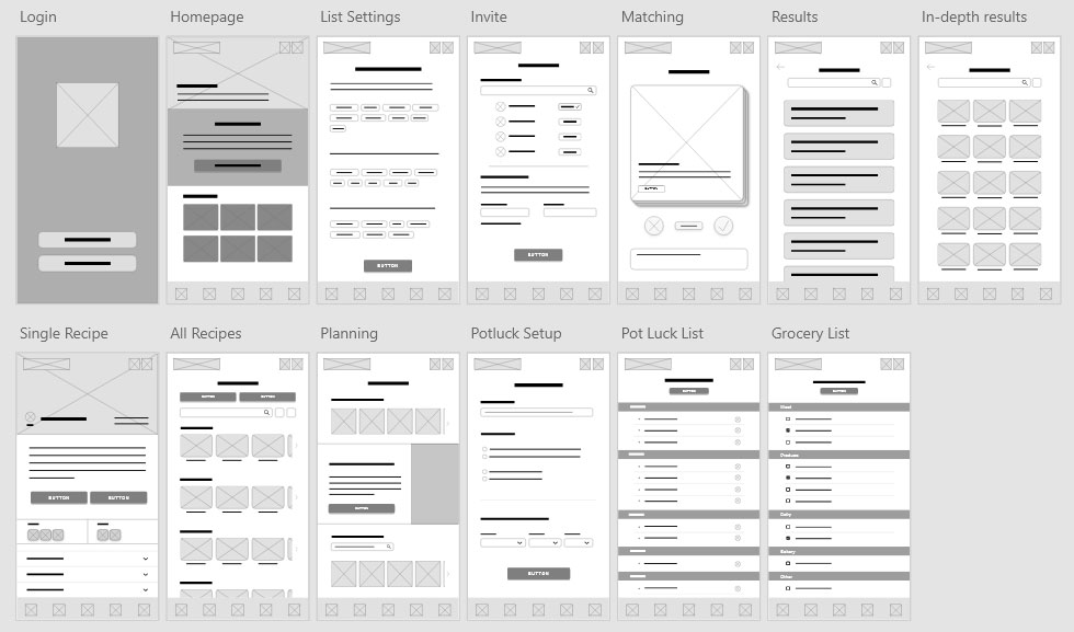
Click image to enlarge
Usability Testing
Using my low-fidelity prototype, my usability study consisted of 5 participants who cook on average 4 nights a week and often makes dinners for multiple people (spouse, children, roommates, etc.). I asked them each to complete the following:
- Prompt 1: From the home screen, start a new match and vote on a recipe.
- Prompt 2: Now please navigate to the Matches page. From there, please review the results for the “Johnson Family’s Weekly Meals”
- Prompt 3: Now view the “Chicken Stir-Fry” recipe and look at the nutritional facts and then add the ingredients to your grocery list. Please complete this task by finding your grocery list.
- Prompt 4: Please find and create a new potluck list. Follow the process of setting up a potluck list until you are viewing the list.
- Prompt 5: How did you feel about the app overall? What did you like or dislike?
Results
After organizing and grouping the feedback into an affinity diagram, it was clear that three of the main processes needed some improvement:
matching process
overall navigation
results page
potluck lists processes
overall wording
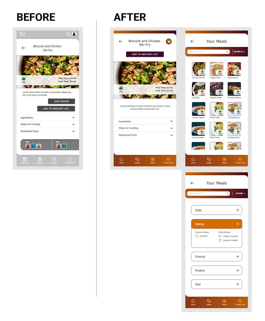
High-Fidelity Prototype
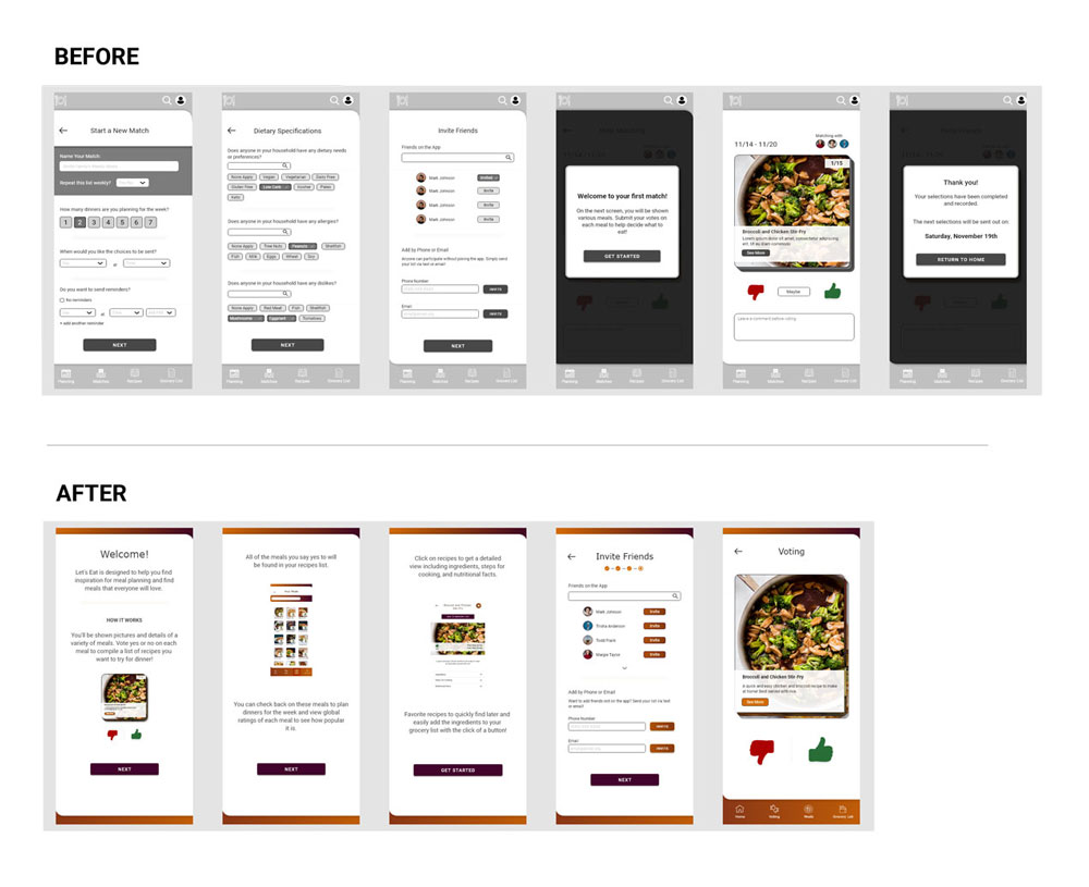
Based on patterns identified through the affinity diagram, some key elements were incorporated into the design:
5 out of 5 participants were confused or frustrated by at least one aspect of the wording and/or functionality of the matching setup process
Users need a more streamlined or reimagined process for voting and picking out meals
Improvements:
- Simplified the process of voting on meals: before users had to set up a "match" for each week, input their information, and invite friends to that specific "match". After, users only have to input their information and invite friends once at sign up. They can then simply vote and filter the results by friends if they want to find meals they have in common.
- Three instructional pages were added to the signup process to give users a better understanding of the app as they get started
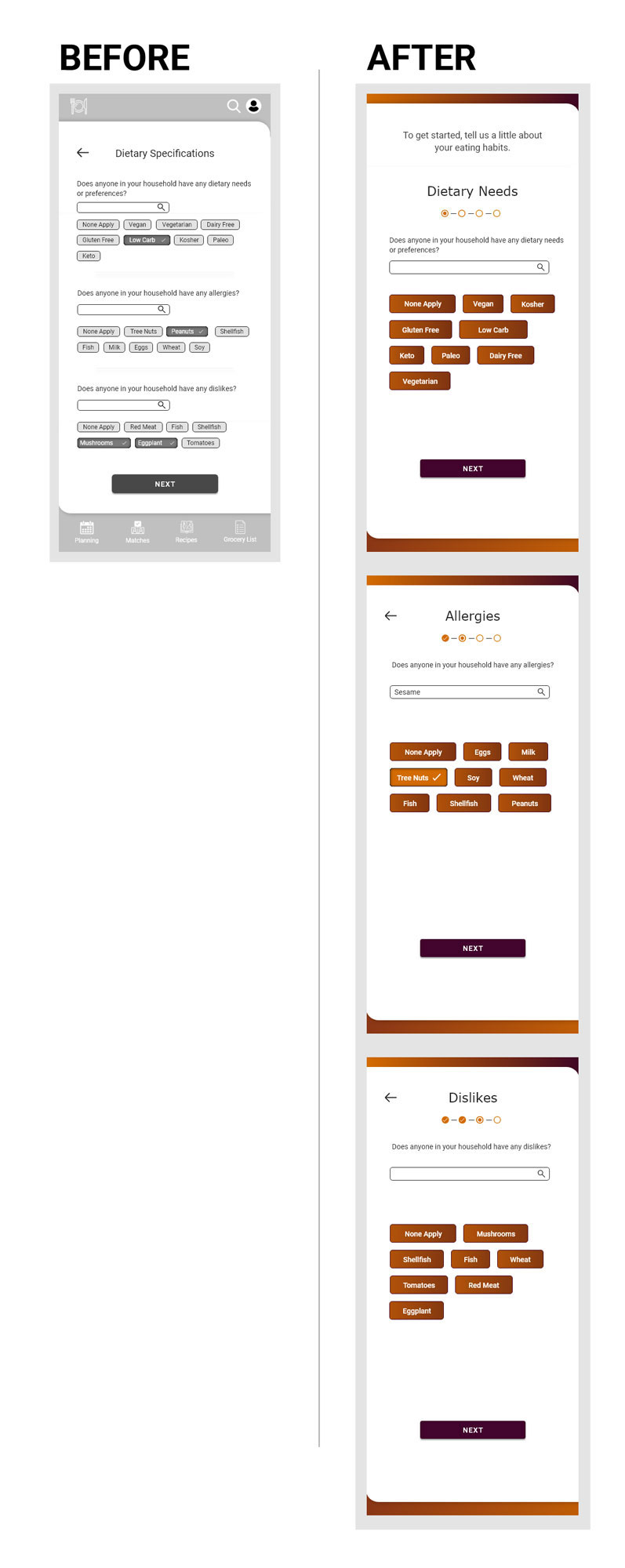
4 out of 5 participants were frustrated by the dietary preferences buttons being too small and/or overwhelming
Users need buttons to be updated to include larger sizing, additional spacing, and clear communication
Improvements:
- The dietary preferences were separated into three pages with a progress indicator: dietary preferences, allergies, and dislikes
- Button size was increased for easability and color was added to create more contrast
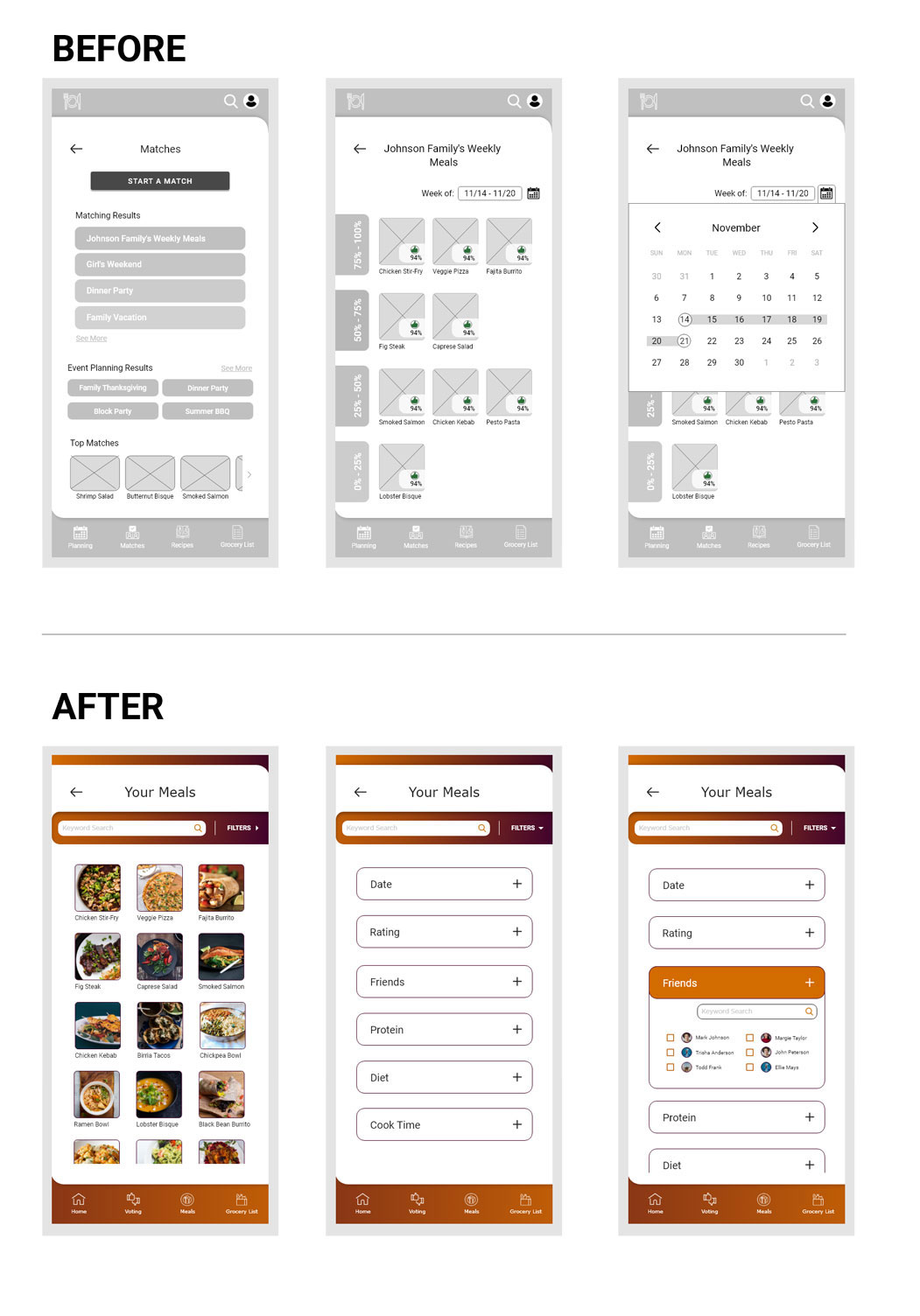
5 out of 5 participants were frustrated and/or confused by the wording on the matches page which shows results from voting
Users need wording to be more descriptive and clear to find their results easily
Improvements:
- With the voting process updated, the results page could be updated as well to one singular page showing all recipes voted as a "Yes"
- Filters were added to help users sort through the recipes. Filters include: favorites, global ratings (compiled from all users), friends, protein, etc.
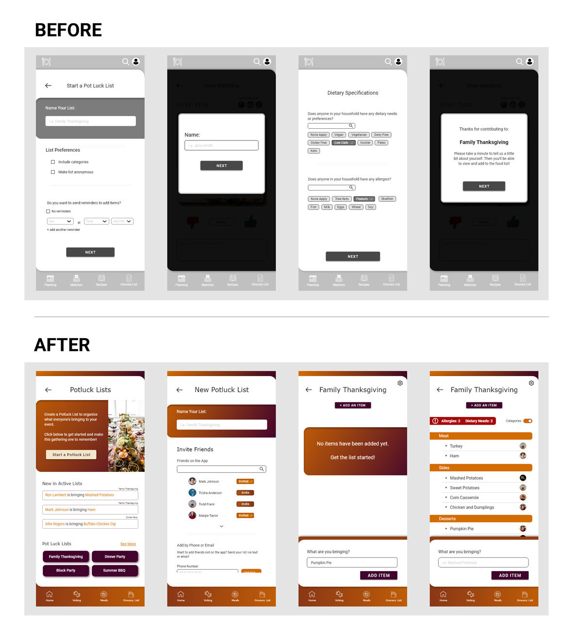
5 out of 5 participants were frustrated by the lengthiness of the setup process for potluck lists
Users need the setup for potluck lists to be simplified and potentially pull in information from their account to reduce repetition
3 out of 5 participants were confused by the wording of the potluck list process and page
Some users need clearer language and more direction on how to proceed through creation process
Improvements:
- The app will now pull in information for users with a profile so they don't have to re-enter information on setup to reduce lengthiness
- Settings were simplified and features, like reminders and anonymous lists, that weren't useful to users were removed to reduce confusion
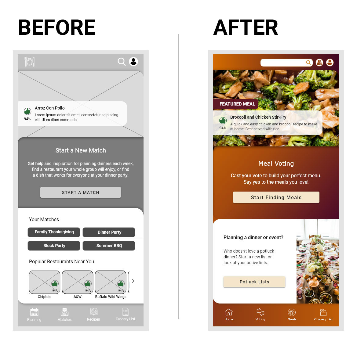
4 out of 5 participants struggled with navigation at some point throughout the app testing
Most users need the navigation to be simplified and easier to follow
Improvements:
- Bottom navigation was updated with clearer wording and iconography
- Homepage was simplified and more text was added to help users more quickly find their way around
- The restaurant feature did not prove to be wanted or useful to users so it was removed which simplified navigation by reducing options
3 out of 5 participants were confused by the process of saving recipes versus looking at recipes in their matching results
For some users, these two functions need to be consolidated or offer more variety to justify two separate pages
Improvements:
- "Save Recipe" button was removed from the single recipe page
- A "favorite" icon was added in it's place and favorited recipes can now be viewed through filtering
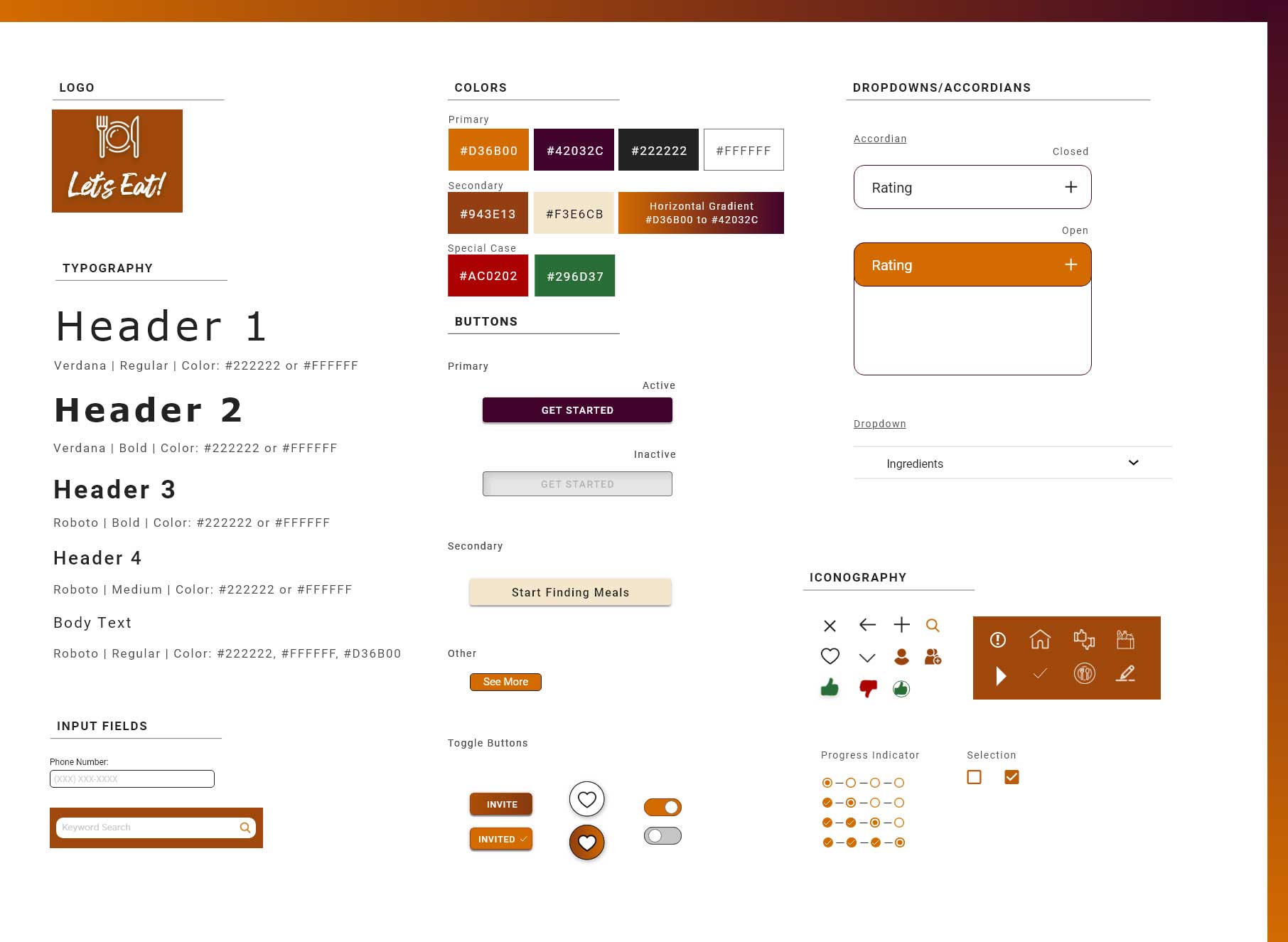
Design System
Next Steps & Recommendations
Accessibility:
- Conduct user testing with individuals who have disabilities to gather feedback and ensure accessibility needs are met
- Ensure the app is optimized for keyboard and screen reader accessibility and complete testing
Hand-off:
- Create a detailed outline explaining design decisions and interactions
- Ensure all design files and assets are organized and labeled correctly
Additional Testing:
- Conduct further usability testing to gather feedback on the updated user flow and design
- Conduct further usability testing to determine if the matching feature or restaurants options should be added back in at a later date
After Launch:
Track the following KPIs to identify success and areas for improvement:
- Number of downloads: How many people are interested?
- Retention rate: How many people are continuing to come back and use the app on a regular basis?
- Session Length: How much time are users spending on the app?
- Customer Satisfaction: How are the users responding to the app?
Use this data to identify data-driven areas for improvement
Partner with grocery stores to allow participants to order their grocery list for pickup or delivery
Lessons Learned
Start Small and Work Up
The idea for this case study was an exciting one for me, but I got a little too enthusiastic
about the idea. This led to adding too many features from the get-go creating a design that was
choppy and difficult to follow.
Start small and make sure the key features are well designed before trying to add more. Without
a strong foundation, the app won’t be able to grow.
One Size Does Not Fit All
When designing this app, I thought it would be very easy to follow as it is inspired by popular
dating apps that millions of people use. However, that was not the case and the feedback I got
during my usability test consisted mainly of confusion.
Just because a process is simple to follow with one topic, that does not mean it will translate
well and work well with other topics. Each process must be customized and fitted for the
specific topic, product, or service.
Wording is Weird
After this usability study, I truly understood how differently wording can be interpreted by
different people. Not just based on education level, but based on context and past experiences.
Testing your wording is just as important as testing the design. Without clear instruction, your
design cannot always be interpreted as you want it to. UX writing is such a vital part of UX
design.