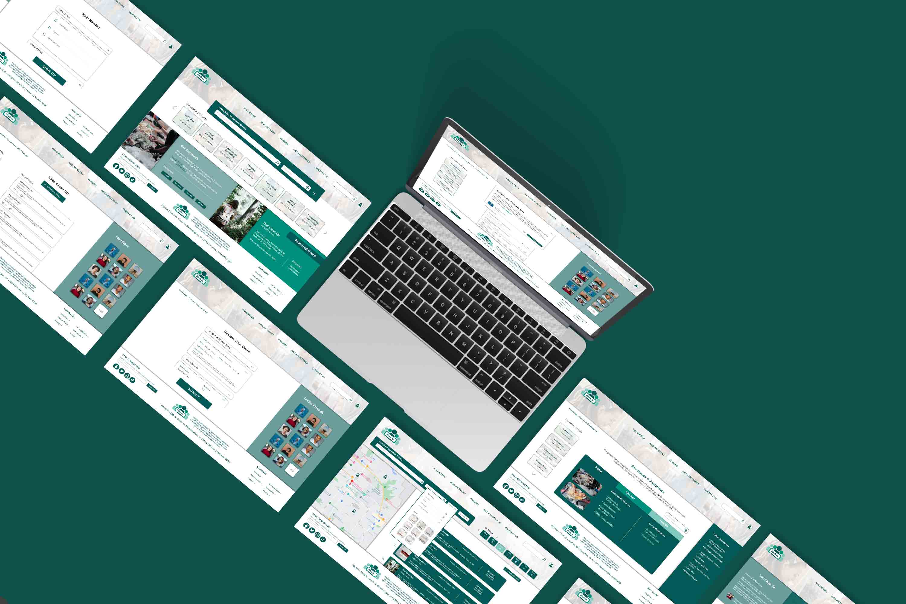
PitchIn
Case Study
Website and app for volunteering
Research | Users | Wireframes | Usability Test | High-Fidelity Prototype | Design System | Next Steps | Lessons Learned
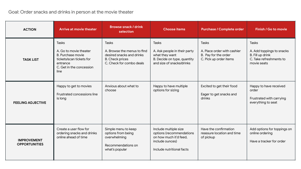
The Credits is a movie theater located in Cincinnati, Ohio that has been open for the last 30 years. They are constantly seeking to enhance their customers' experience, and they have noticed the growing popularity of dine-in movie theaters. In response to this trend, they are exploring ways to improve their concession stand offerings.
Create a responsive website that addresses the inconvenience of long concession lines and customers missing parts of the movie to get refreshments.
They aim to reduce the time customers spend away from the movie and improve their movie going experience.
I started my research by taking a look at 4 movie theater chains to get a feeling for the processes that already exist. Some theaters offer in-house dining while others only offer snacks and drinks. My competitive analysis showed me:
With some initial information gathered, I was ready to start getting to know my users and learn about their experiences.
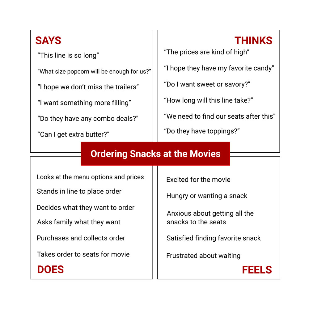
I began by talking to people who attend the movies at least once a month.
I asked about their ordering habits, who they tend to go to movies with, and challenges
they
face in the process.
This is what I learned:

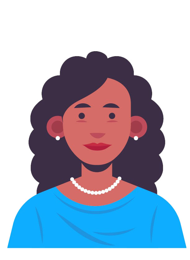
Occupation: Dental Assistant
Hometown: Cincinnati, Ohio
Family: one child
"Going to the movies is an experience for our family, from the trailers, to the snacks, to the main show!"
Goals:
Frustrations:
Anthony is a devoted father to a 7-year-old autistic child. He cherishes
spending
quality time with his son,
especially at movie outings where they can indulge in their shared passion
for
films.
As Anthony’s child has special needs, he seeks a simplified and
efficient
ordering process that
minimizes wait times and provides clear communication. He
needs
reliable and accessible service
that accommodates his son’s diet and allows him to spend more time enjoying
the
movie stress-free.
" My children have different interests and are all different ages, but movies are something we all can enjoy together "
Goals:
Frustrations:
Mia is a dedicated daycare teacher with a husband, 4 children, ranging from
13 to
28,
and 2 grandchildren.
The movies are something her whole family can enjoy
together
despite their busy schedules and different interests.
With a large family, Mia is looking for ways to simplify the ordering
process.
She
needs a way to easily coordinate
several orders, assistance with delivering refreshments to the
seats,
and wants to minimize her to-do list to enhance
her experience.
Occupation: Daycare Teacher
Hometown: Cincinnati, Ohio
Family: Partner, 4 children, 2 grandchildren
Click image to enlarge
Click image to enlarge
Click image to enlarge
Click image to enlarge
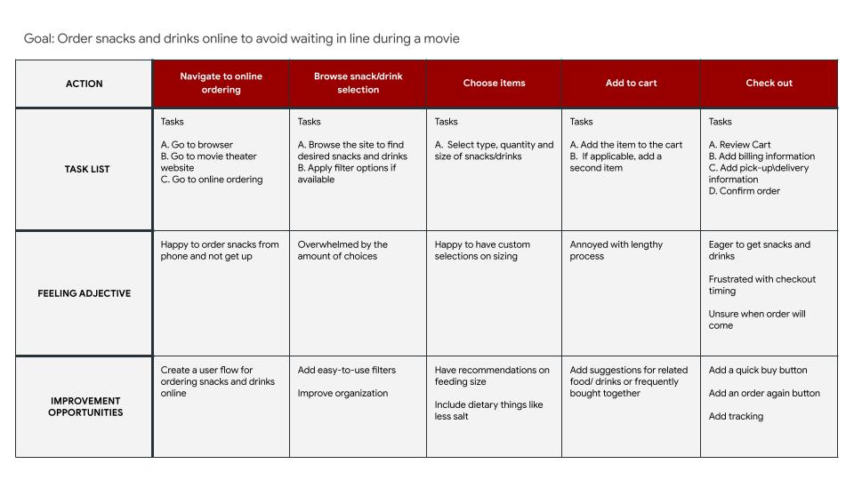
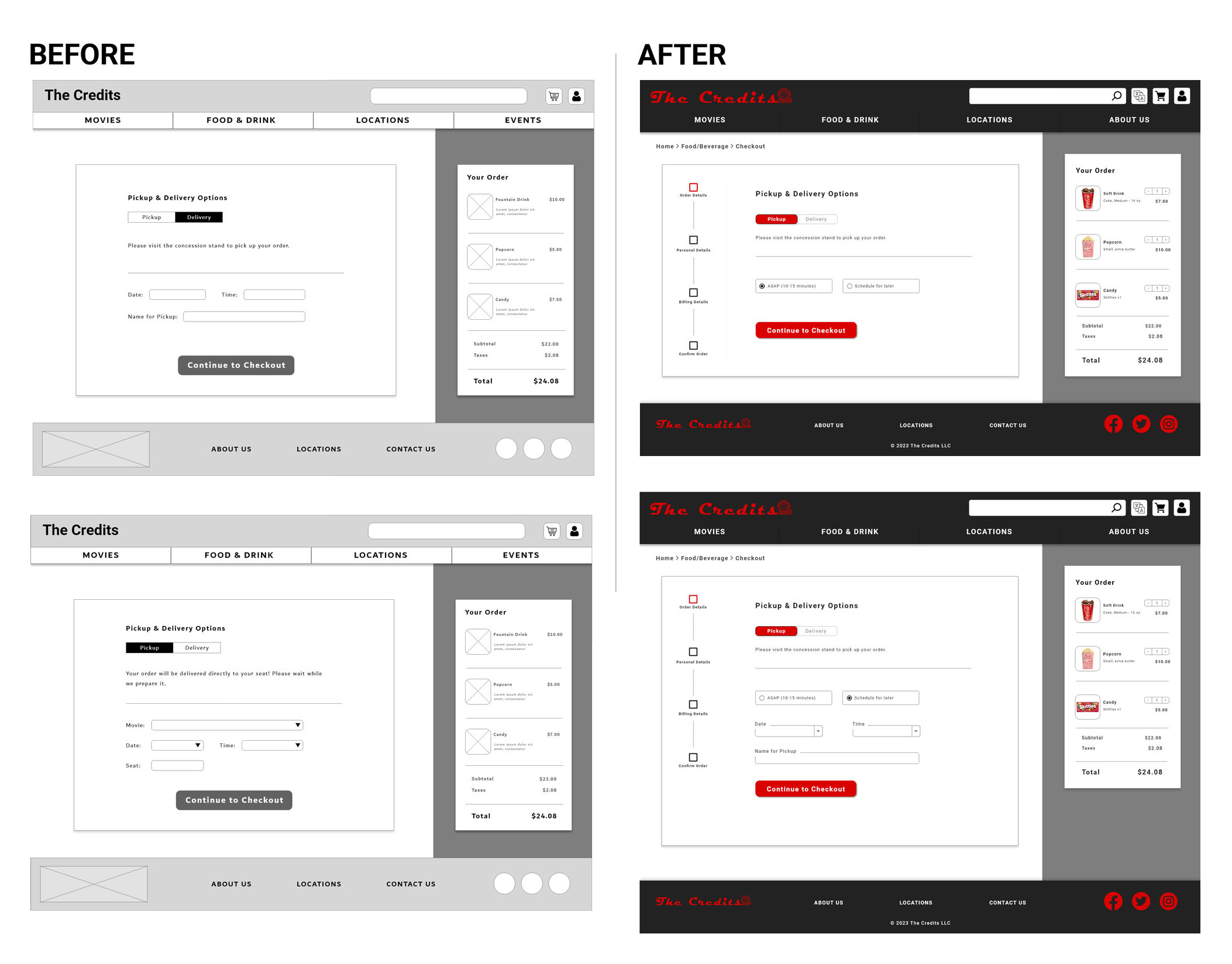
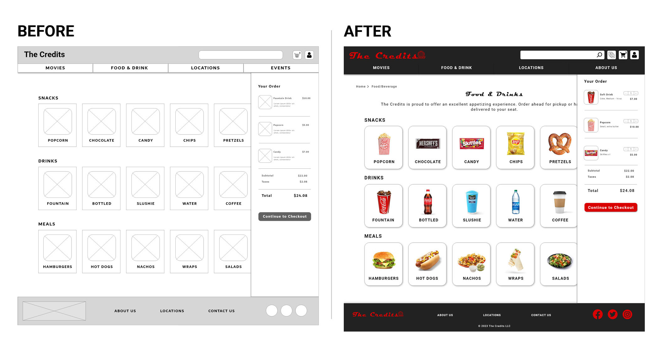
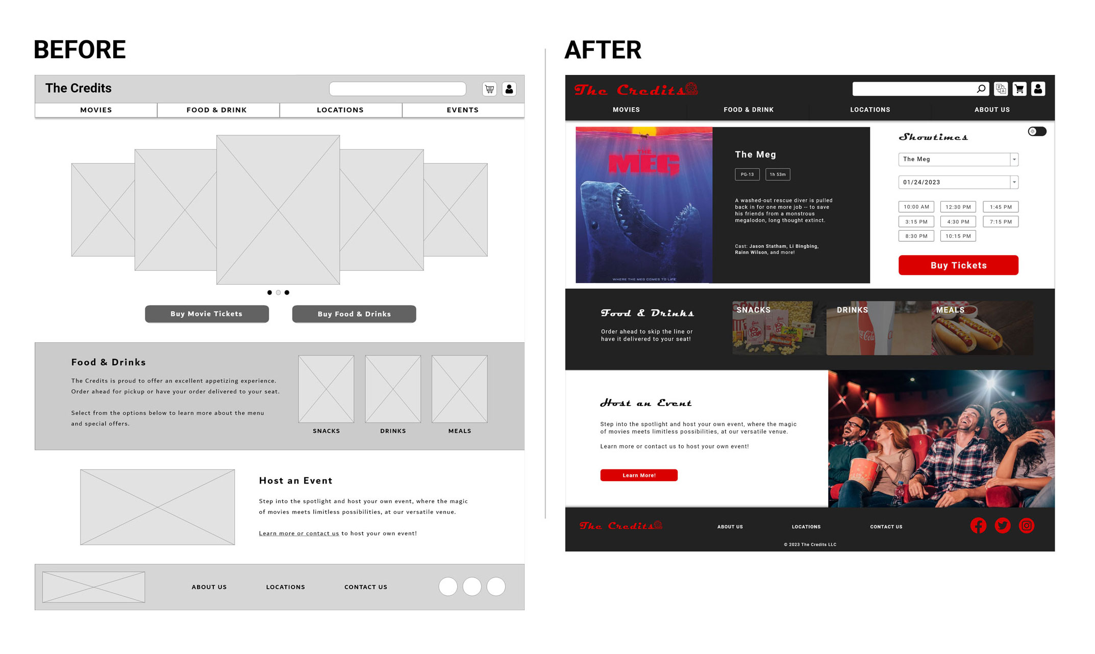
Based on the research and empathy exercises, the design should include solutions that save the user time. Users want to have the option to order ahead or get delivery to their seat. The design should include an intuitive ordering process and a quick checkout process. View wireframes in-depth.
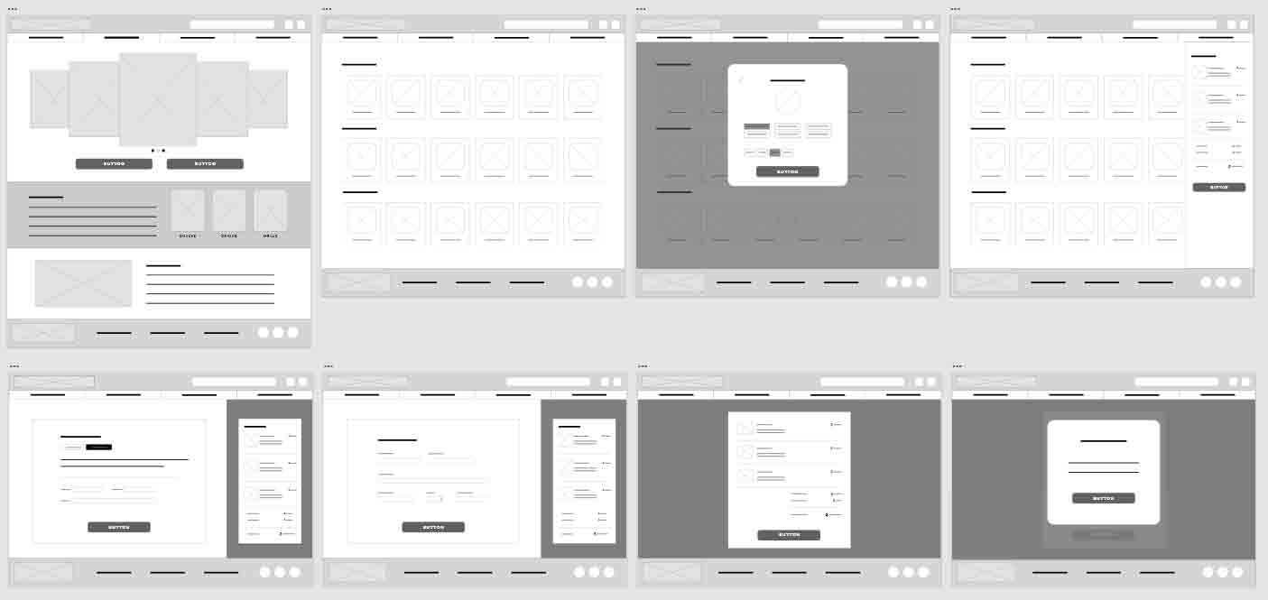
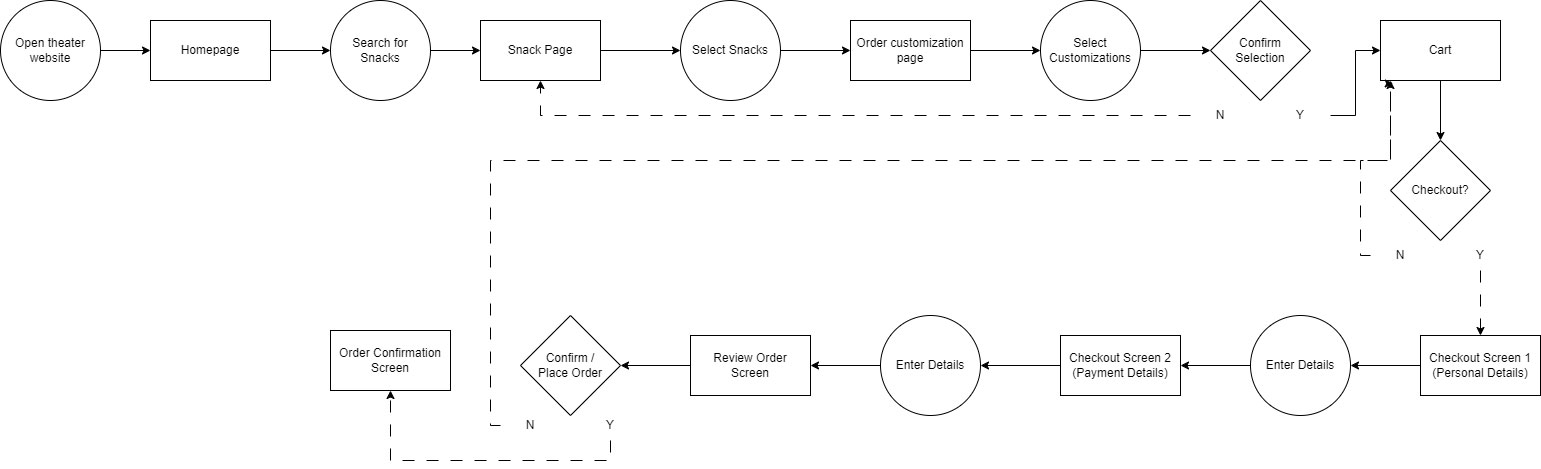
Click image to enlarge
Using my low-fidelity prototype, my usability study consisted of 5 participants who go to the movies at least once, every 1-2 months. Using my digital wireframes, I asked them each to complete the following:
After organzing and grouping the feedback, it was clear that three of the main processes needed some improvement: the ordering process, the checkout process, and the cart.
After organzing and grouping the feedback into an affinity diagram, it was clear that three of the main processes needed some improvement:
ordering process
checkout process
cart feature
Based on patterns identified through the affinity diagram, some key elements were incorporated into the design:
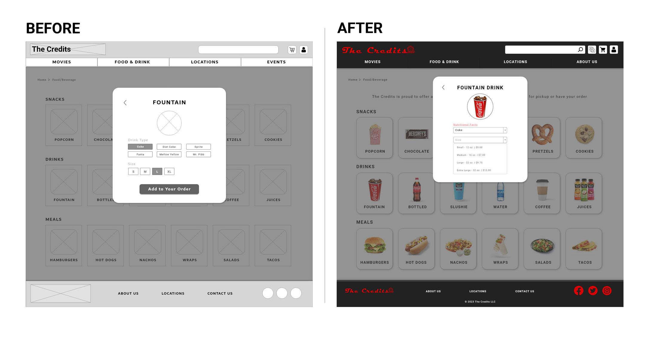
Users need clearer communication and more information about food/drinks to make an informed decision and purchase
Improvements:
Users need a simplified checkout process that can pull in information from the account to reduce input
Improvements:
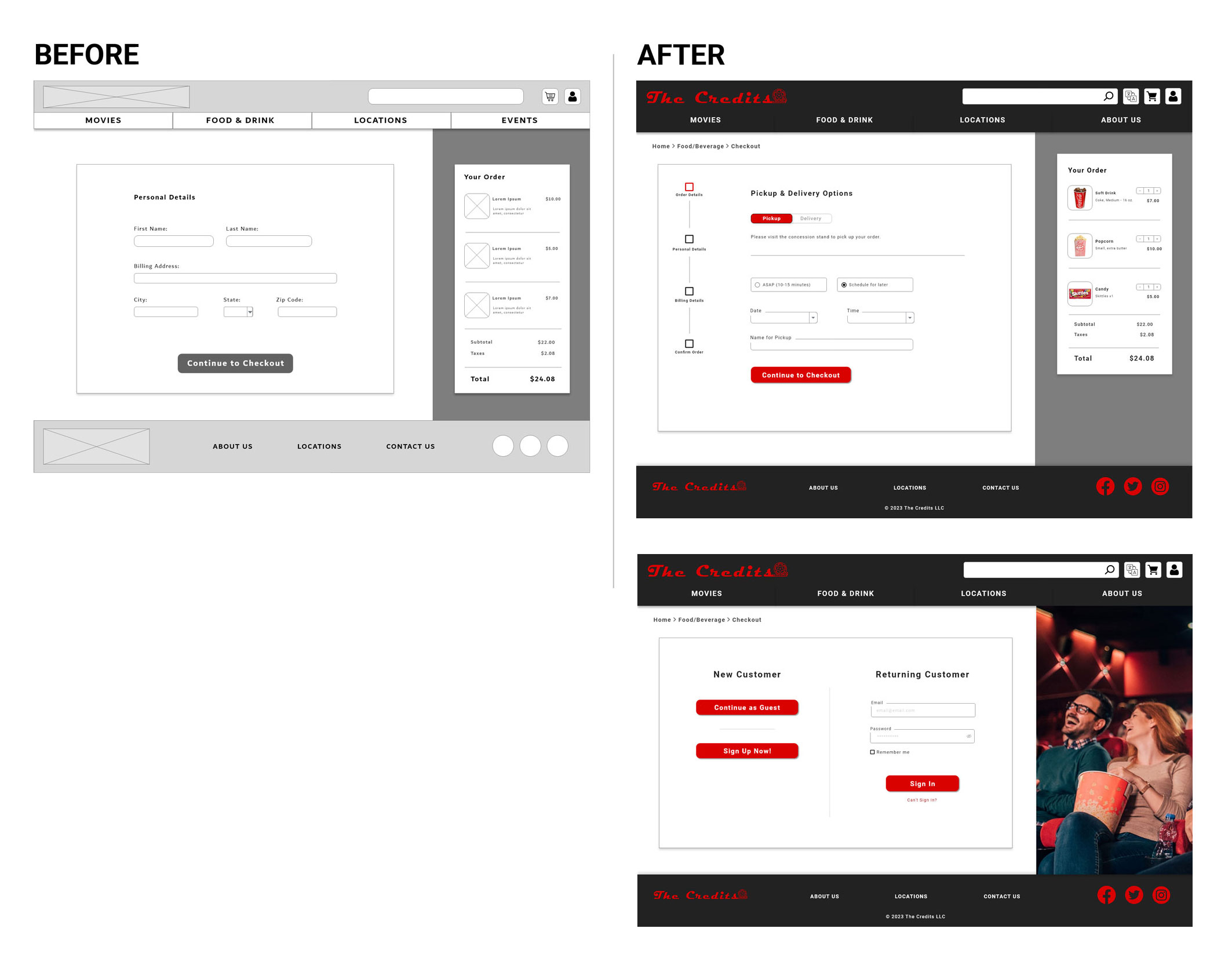
Users need to have more options for ordering, including the option to order ASAP to help quicken the user flow
Improvements:
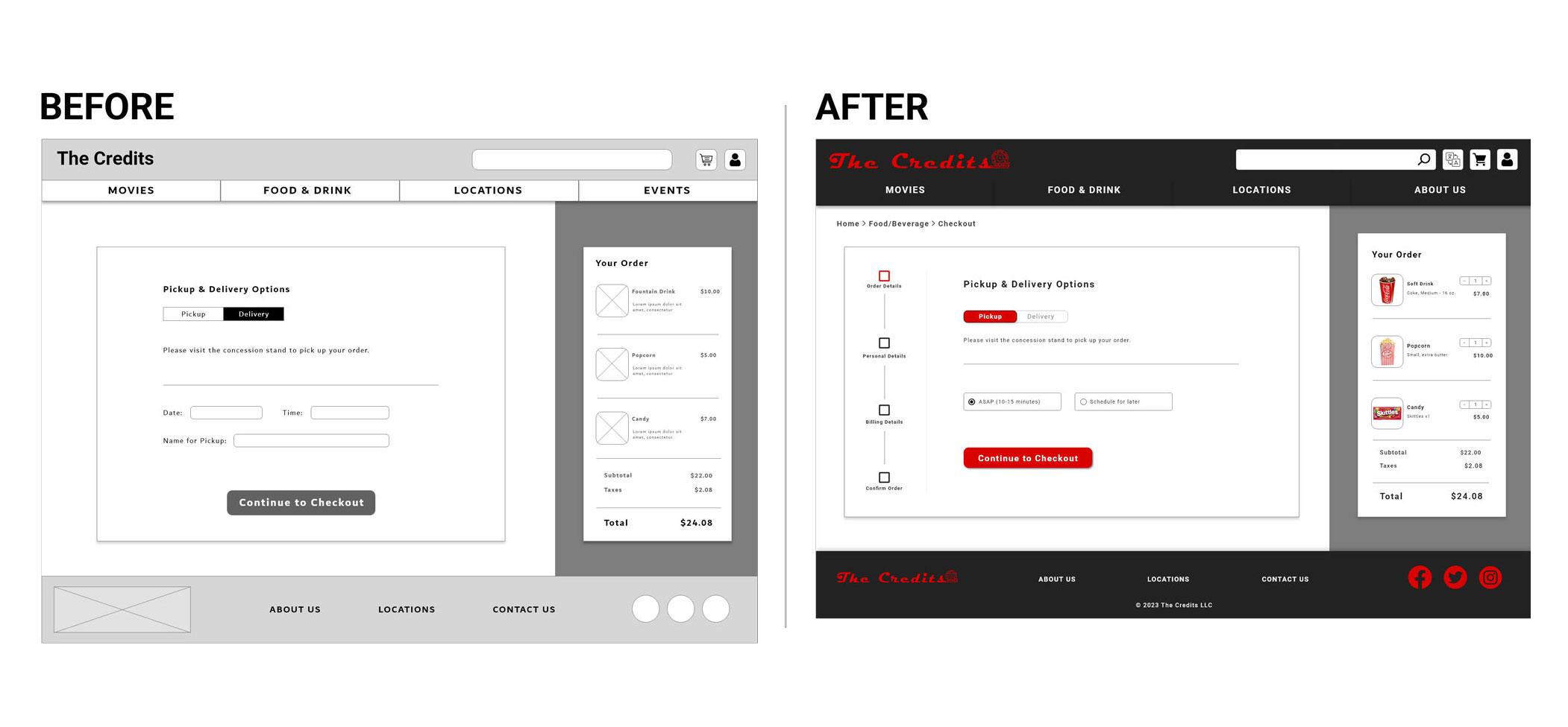
Users need buttons to be more intuitive and indicative of which option is selected
Improvements:
Users need more useful cart features including ways to edit their order, add or remove items
Improvements:
While purchasing movie tickets was not the focus of this case study, I felt it was important for the overall design to rework the homepage and include this
Improvements:
Track the following KPIs after launch:
While I thought a movie refreshment ordering process would be simple and quick to
create,
as
they already exist for many theaters, it turned out to be less black and white. This
project
was a great reminder that every project deserves just as much love and attention as
the
next.
Just because a process already exists in the world, each unique company needs work
that
is
custom tailored to their needs and services. And that tends to lead to a new set of
challenges, even for something that may seem familiar.
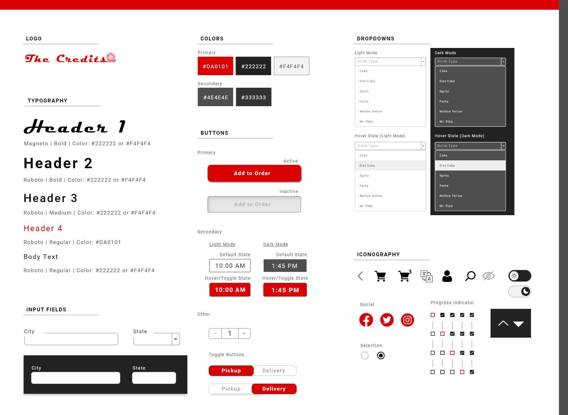
While switching from dark and light mode might be a simple click for users, it
entails
much
more for the designer. This was the first project in which I included the option to
switch
between dark and light mode and I learned that it takes careful consideration to
transition
your design over to a dark mode.
One of the biggest considerations was accessibility. Once I transitioned to darker
backgrounds, how would I ensure the text, icons, and color scheme still made the
site
easy
to read and use while keeping consistent feeling and branding?
It can be easy to miss little (or big) details when you’re sucked into a new design
and
deciding if that text box should be one or two more pixels to the left. On this
project,
I
realized I did not include pricing anywhere in the design until making modifications
to
the
high-fidelity version.
While this could have been a large mistake, it was quickly taken care of by simply
having a
fresh pair of eyes look over the design and point out what was missing. Thank you
usability
studies!