Research | Users | Wireframes | Usability Test | High-Fidelity Prototype | Design System | Next Steps | Lessons Learned
Overview
Bunny's Bakery, an Indiana-based bakery, takes pride in serving its local community with delicious custom desserts. Catering to a variety of events, they aim to simplify the dessert ordering process for adults seeking customized treats for their special occasions.
the goal
Create an app that streamlines the process of ordering personalized desserts, improving the way customers interact with the bakery. With a user-friendly interface, the app will provide a guided, hassle-free experience.
Starting with Research
Before even thinking about design, I wanted to get a feeling for what products were already out there. I analyzed websites and apps of 4 local bakeries and 1 national chain and found this:
Admired and Inspired By:
- Options to make small customizations to orders
- Well-structured menus make options easy to find
- Visual cues that lead you through ordering
- Simple, quick checkout process
Room for Improvement:
- Most local bakeries only have websites, no apps
- Lack of information on decoration options
- Lack of guidance on customized dessert orders
- Unclear messaging on available flavor options
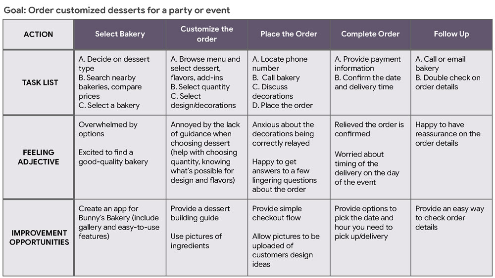
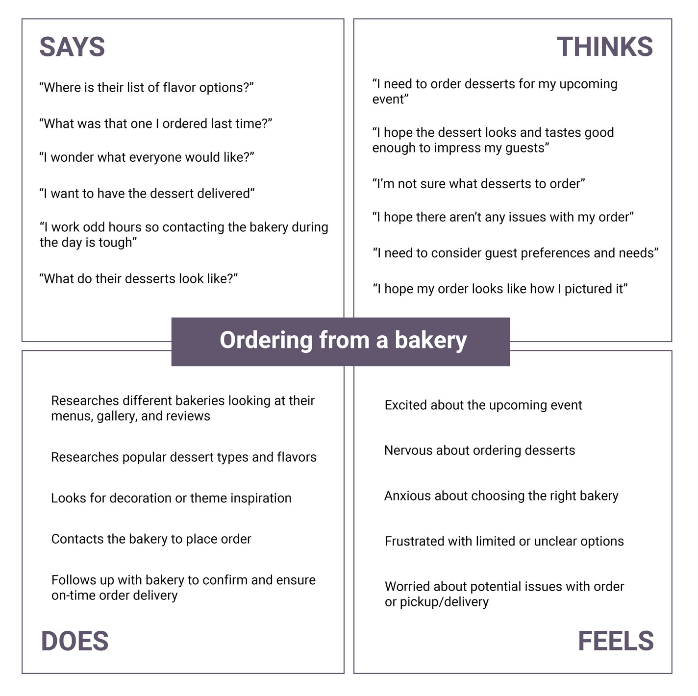
Let's Meet the Users
With some initial information gathered, I was ready to start getting to know my users and learn about their experiences.
research goals
- understand common challenges people face when ordering desserts, particularly for events and parties
- pinpoint common frustrations people experience with the ordering process at bakeries
I began by talking to some people at local bakeries, specially looking for those who order desserts at least once every two months. I asked about their schedules, ordering habits, and challenges they face in the process.
Kathy, 41

Occupation: Nurse
Hometown: Bloomington, Indiana
Family: Partner, three children
" I love planning celebrations for my family but I don’t have time to do it all myself "
Goals:
- Find ways to celebrate family and friends
- Be a role-model and support system for her family
- Minize her to-do list to spend more time with loved ones
Frustrations:
- Doesn't have the time or know-how to make her own desserts at home
- Lack of guidance when ordering, not enough explanation of options
- Needs clear communication and assurance her order will be correct
Kathy is a dedicated nurse and mother of three who highly values her relationships with family and friends. She enjoys celebrating special moments with custom desserts for parties, school, and work events.
" I need quick, reliable solutions to help me create memorable experiences "
Goals:
- Find a reliable bakery for catering events
- Find quick and efficient solutions to tackle his long task lists
- Create more memorable experiences for the events he plans
Frustrations:
- Inconsistency in the quality of desserts as he orders frequently
- Late deliveries can disrupt the flow of the event and cause stress
- Limited options can make it difficult to accommodate attendees
Jeremy is an organized, detail oriented executive assistant who enjoys going the extra mile to create a positive experience. His' primary role is to manage and coordinate events and meetings, ranging from small and informal to large-scale conferences.
Jeremy, 28

Occupation: Executive Assistant
Hometown: Bloomington, Indiana
Family: Single
Click image to enlarge
Click image to enlarge
Click image to enlarge
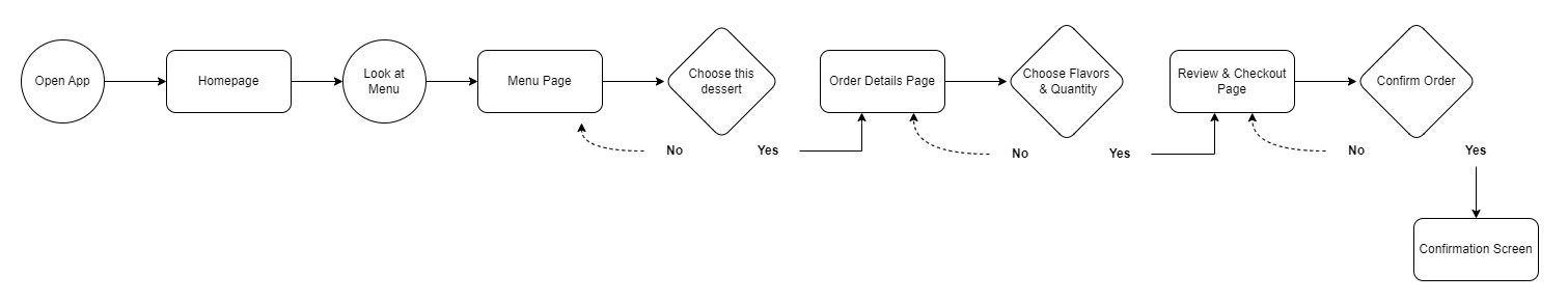
Wireframing
Based on the research and empathy exercises, the design should include solutions that save the user time. Users want to make informed decisions but don't want to be overwhelmed by choices. The design should include an intuitive process to easily build the user's ideal dessert order. View wireframes in-depth.
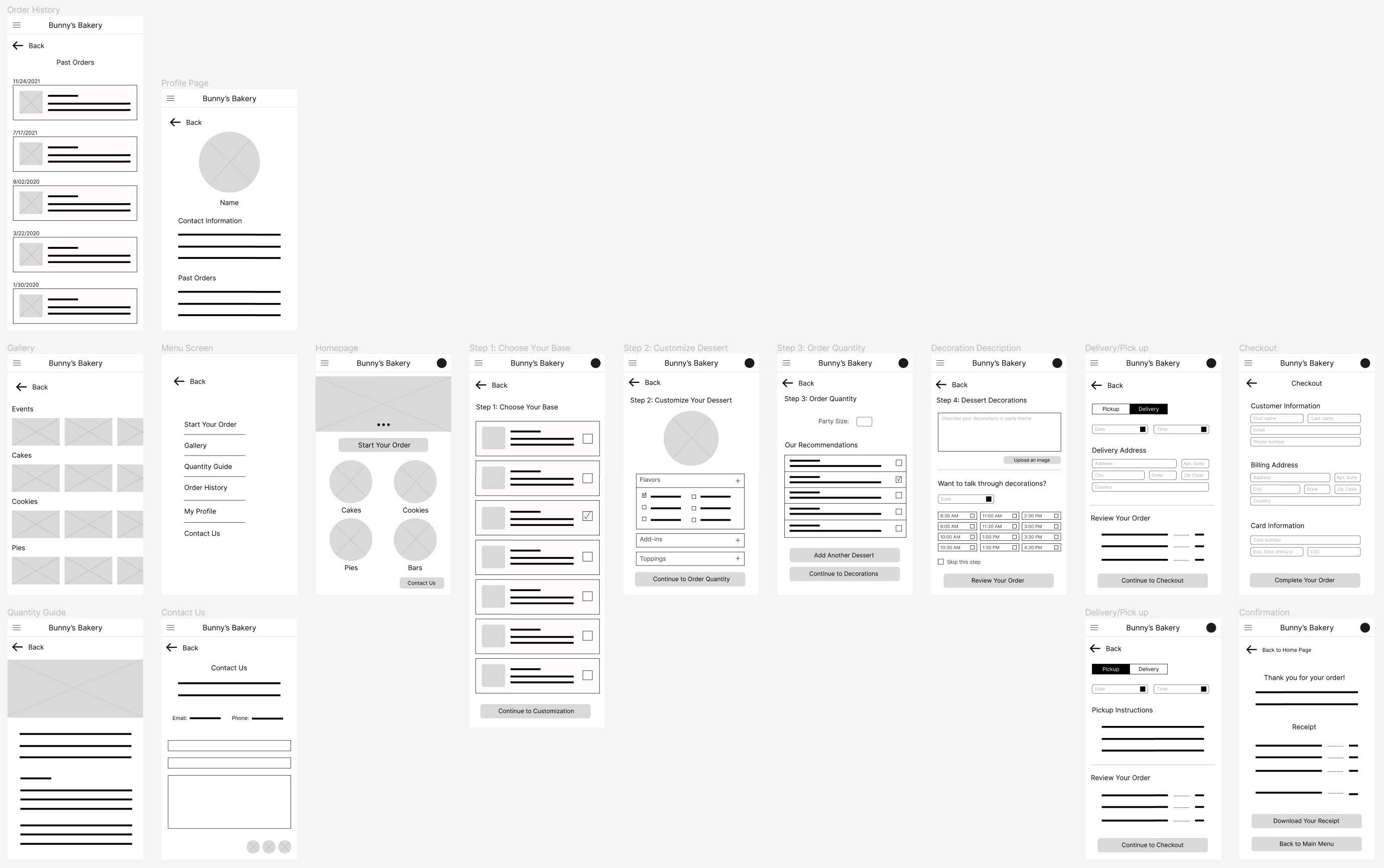
Click image to enlarge
Usability Testing
Using my low-fidelity prototype, my usability study consisted of 6 participants who order from a bakery at least 3-4 times a year. Using my digital wireframes, I asked them each to complete the following:
- Prompt 1: From the home screen, navigate to the start an order page and choose your dessert
- Prompt 2: Continue and customize the dessert with your flavors, toppings, and add-in choices
- Prompt 3: Add a second dessert and customize it
- Prompt 4: Navigate to decorations and describe your theme/decorations for the dessert
- Prompt 5: Now to finish the ordering process, select your pick-up/delivery options and check out
- Prompt 6: How did you feel about the bakery app overall? What did you like or dislike?
Results
After organizing and grouping the feedback into an affinity diagram, it was clear that three of the main processes needed some improvement:
decoration selection
quantity selection
ordering & customization
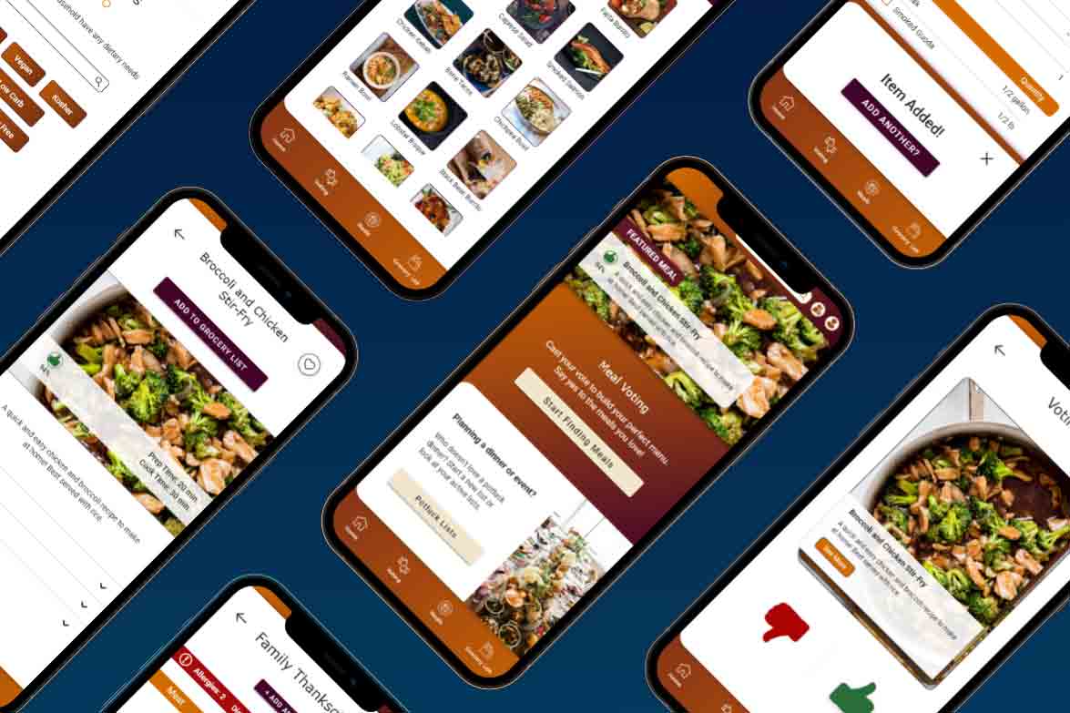
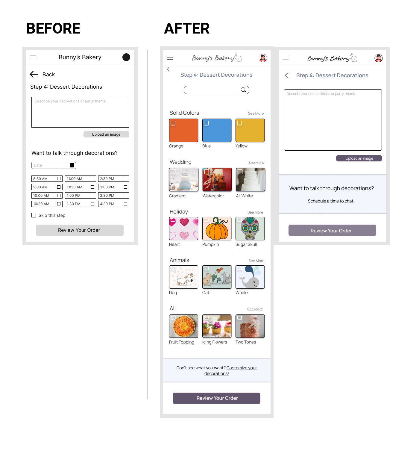
High-Fidelity Prototype
Based on patterns identified through the affinity diagram, some key elements were incorporated into the design:
For 4 out of 6 participants, it was unclear on what they were expected to input in the dessert description text box or if scheduling a call was required
Users need clearer guidelines or prompts to improve user experience and increase the likelihood of order completion
Improvements:
- Changed the decoration decision process by providing options to choose from
- Reworked but kept the option to submit comments and pictures or schedule a call to accommodate user with complicated orders
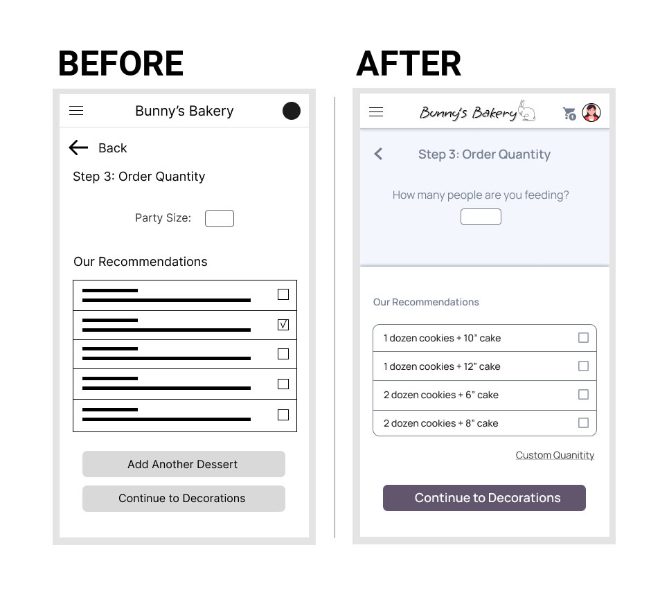
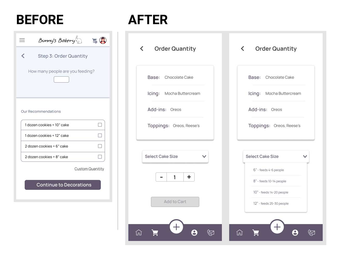
For 4 out of 6 participants, the quantity recommendations page caused frustration with unclear wording and processes
Users need more familiar user flows or clearer cues and explanations to simplify process
Improvements:
- The term “party size” was confusing to users so I updated the language to make it more clear
- Included navigation to a custom quantity page for those who don’t want to use the recommendations
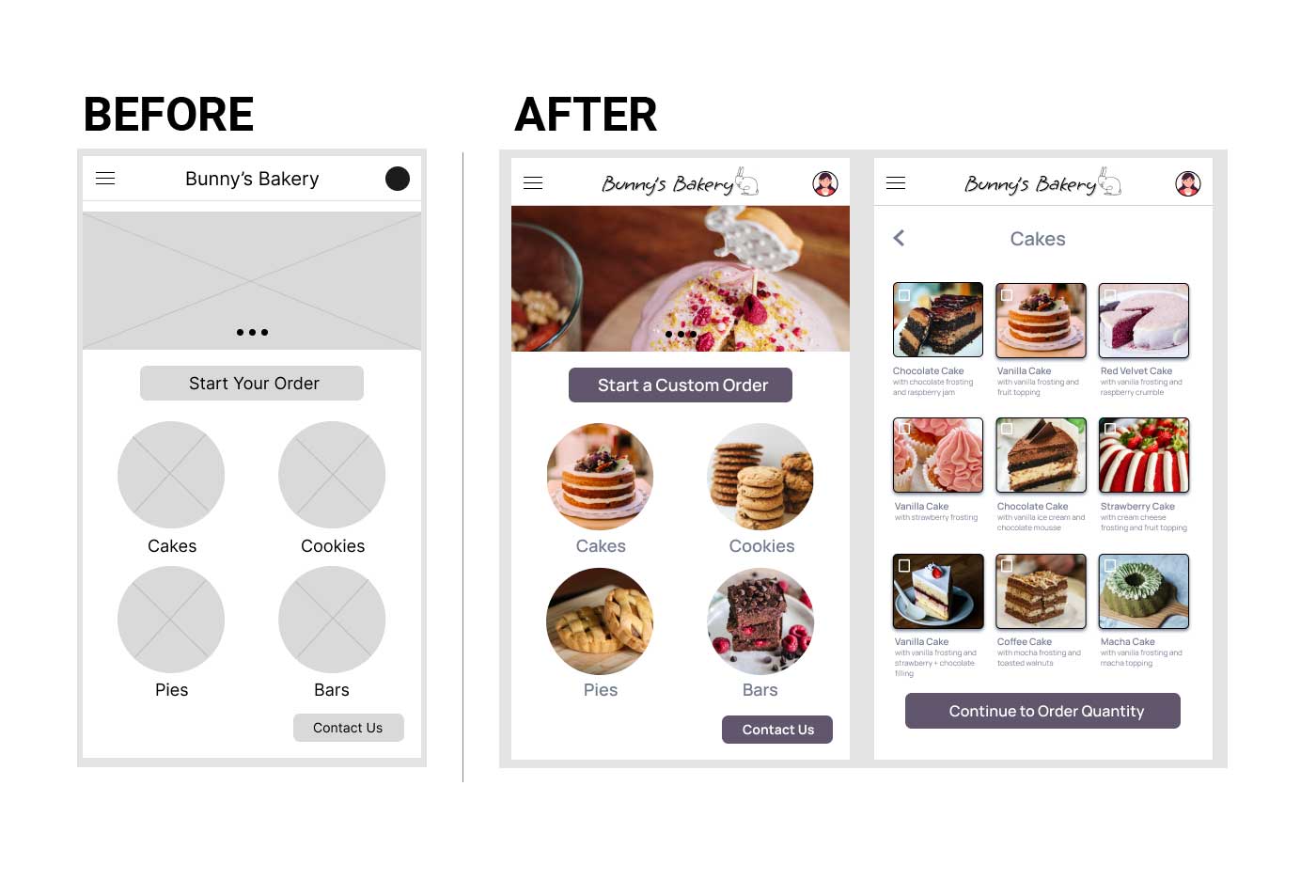
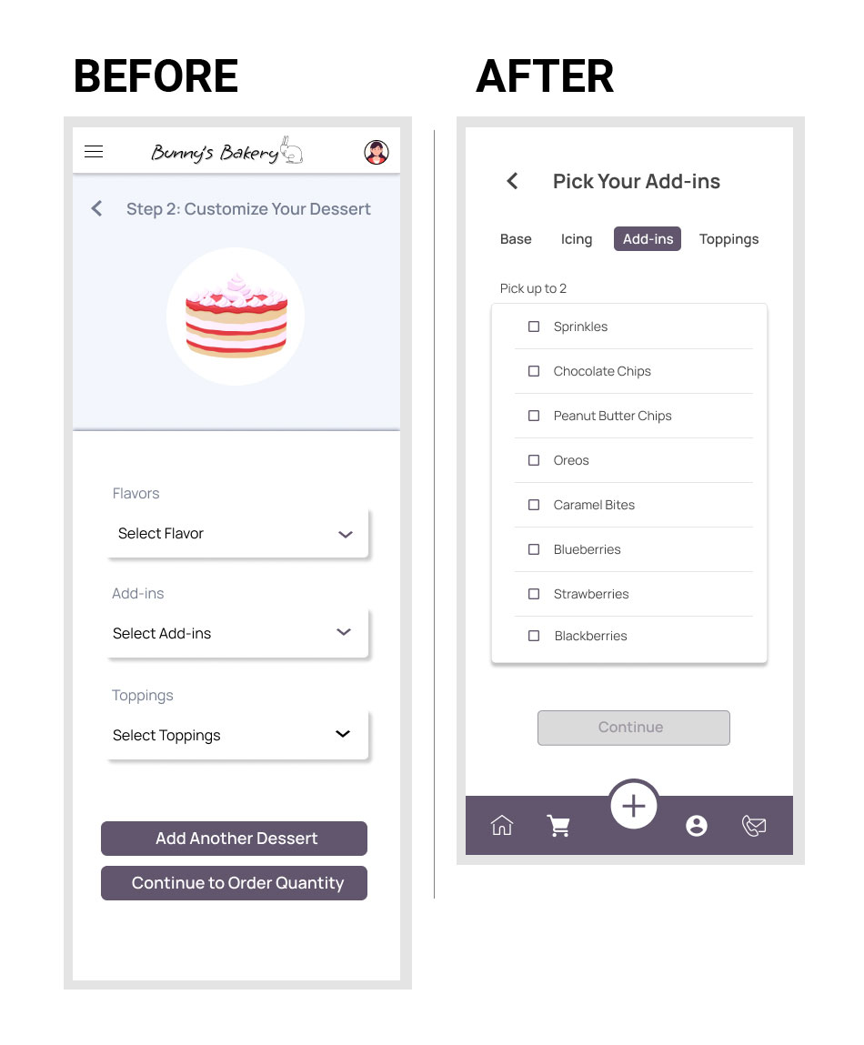
3 out of 6 participants were frustrated that there were no preset desserts options, only customizations
Users need a variety of ways to complete an order to meet their individual preferences and needs. While some users may prefer the flexibility of customization, others may find it overwhelming or time-consuming
Improvements:
- The circular images now navigate to preset dessert ordering
- Changed the button wording to “custom order” to highlight the difference between the ordering options
Usability Testing Round 2
The second usuability test proved that there were still some major issues in the user flow and visual design. The frame sizes were adjusted to optimize the experience on mobile screens and the visual design and user flow were reworked.
3 out of 5 participants said the app felt “young and cute” which does not match the established voice the bakery wants to convey
Improvements:
- Updated the visual design to include elements with a more modern and clean style
- Improved various selection processes to reduce clutter and better convey the variety of options they offer
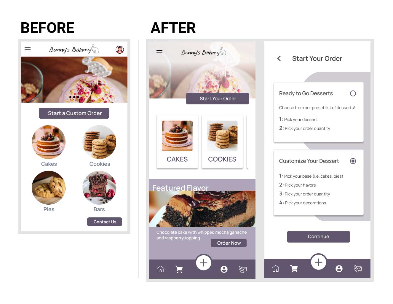
For 3 out of 5 participants, the destinations of the homepage navigation were unclear
Improvements:
- Reworked the homepage to include multiple paths for starting an order
- Changed the button wording to “custom order” to highlight the difference between the ordering options
- Switched to bottom bar navigation and included a prominent “add” button so users can start an order on any page
4 out of 5 people were frustrated with the quantity recommendations and prefer to quickly input their own quantities
Improvements:
- Completely reworked the quantity page to streamline the process
- Users can now more quickly choose their quantity without cognitive overload from too many forced options
*Note: users can still reference the quantity guide from the hamburger menu on the homepage
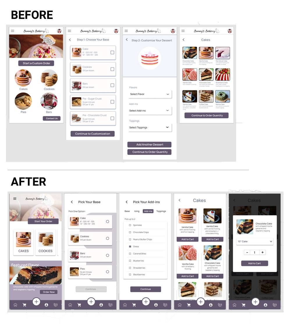
2 out of 5 participants were annoyed that they could not quickly look between flavor options to compare choices
Improvements:
- Switched the flavors menu navigation to radio buttons and check boxes so users can more easily see and compare all the offerings
- Included additional visual cues for clearer communication, i.e. how many options can be chosen, inactive “Continue” button to be sure selections are complete
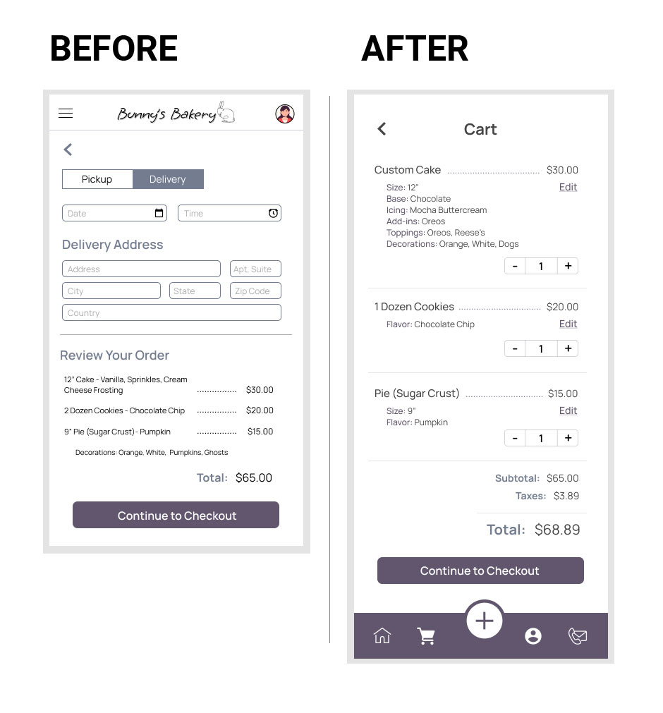
4 out of 5 participants were frustrated that they could only review their order at the start of the checkout process
Improvements:
- Added a cart page that can be easily accessed on any page through the bottom bar navigation
- Included buttons to quickly modify the quantity or edit a selection
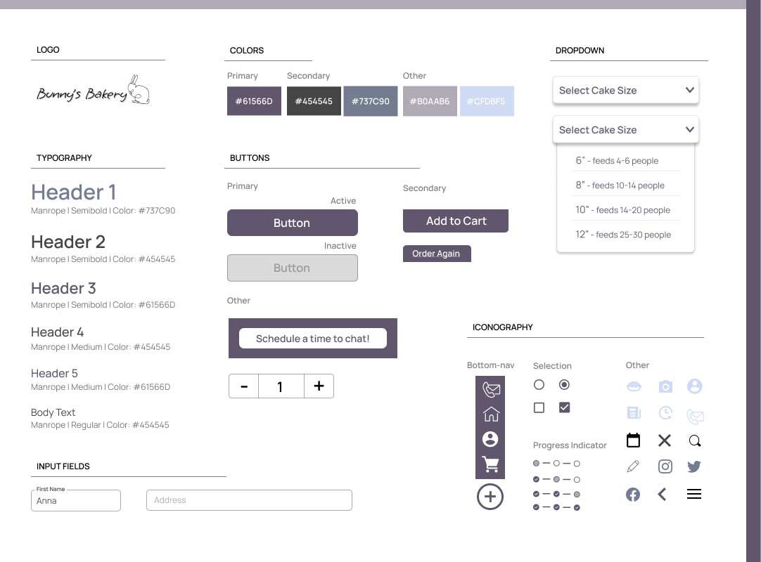
Design System
Next Steps & Recommendations
Accessibility:
- Implement additional accessible design elements such as keyboard and screen reader accessibility
- Conduct user testing with individuals who have disabilities to gather feedback and ensure accessibility needs are met
Hand-off:
- Create a detailed outline explaining design decisions and interactions
- Ensure all design files and assets are organized and labeled correctly
Additional Testing:
- Conduct further usability testing to gather feedback on the updated user flow and design
- Analyze the data from the usability test to find further improvements
After Launch:
Track the following KPIs to identify success and areas for improvement:
- Number of downloads: How many people are interested?
- Conversion rate: How many people are making purchases on the app?
- Return on Investment: How much revenue is the app creating compared to development costs?
- Customer Satisfaction: How are the users responding to the app?
Lessons Learned
Iteration is Key
As one of my first case studies, this project helped me to learn that each iteration truly does make the design stronger. I felt great when I finished my first high-fidelity prototype, but realized after another usability study that there was still plenty to improve. Don’t be afraid that something won’t work out, but rather constantly build and improve off of what you’ve learned.
Feedback is Your Friend
Usability studies pointed out multiple areas where my designs were biased. There were several processes and user flows that I thought were easy to use, but my participants did not agree. Negative feedback isn’t a failure, it’s just another opportunity to make your design even better for the user.
Take A Step Back
It’s easy to get wrapped up in your design, especially when you’ve been staring at your screen for hours making small, tedious changes. This happened to me, which is how I ended up with a high-fidelity prototype without a cart feature. It was an excellent reminder to take a step back from the small details and make sure I’m constantly keeping the user experience in mind.